Skip to content
All

Opmet Serif

Type Design

The typeface of my design studio, Opmet Osserpse, drawn from my handwriting.

Client
Opmet Osserpse, Venice, California
Year
2026
Role
Type designer, 36 styles and two variable fonts

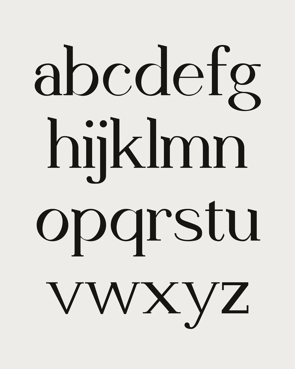
Opmet Serif is the typeface of Opmet Osserpse, and it started from my handwriting. It is a classic serif built from a few pen strokes, with squat, wide letters and round ball terminals. Its stress tilts the other way, toward 1 and 7 o’clock, so every bowl has a wink. The family has 36 static styles and two variable fonts, with weight and optical size axes, and covers 270 languages written in the Latin alphabet.

abcdefg
hijklmn
opqrstu
vwxyz
ABCDEFG
HIJKLMN
OPQRSTU
VWXYZ

The wink

The O’s stress, from upright

Classic stress tilts the thin parts of a bowl to the left, toward 11 and 5 o’clock. Opmet Serif tilts them to the right, toward 1 and 7, on the O, the e, the p and every letter with a bowl. The studio’s name runs backward, and so, slightly, do its letters.

Drawn as strokes

The g, Text Regular

Each letter is built from a few pen strokes, each a line of points with a heading and a width, at three weights and two sizes. The outline comes last, and every weight between is its interpolation.

Weights and italics

Thin 100HandglovesHandgloves
ExtraLight 200HandglovesHandgloves
Light 300HandglovesHandgloves
Regular 400HandglovesHandgloves
Medium 500HandglovesHandgloves
SemiBold 600HandglovesHandgloves
Bold 700HandglovesHandgloves
ExtraBold 800HandglovesHandgloves
Black 900HandglovesHandgloves

Features in use

Small caps

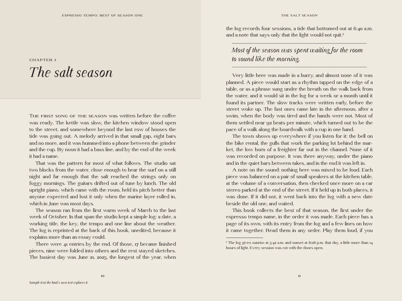
The first song of the season was written before the coffee was ready.

Capitals to small caps

Opmet Osserpse, Venice, California

Oldstyle figures

The tide bottomed out at 6:40 a.m. on June 21, 2025.

Lining figures

1234567890 and $18.50

Fractions

1/2 cup, 3/4 cup and 7/8 of an inch

Superiors and inferiors

22nd edition, a footnote1 and H2O

Slashed zero

2026, 0800 and 100

Case-sensitive forms

(opmet) (OPMET) {OSSERPSE} [2026]

Ligatures

The officer filed a final affidavit

Accents, 270 languages

Ærøskøbing, Zürich, Łódź, İstanbul, façade and IJsselmeer

The whole font

abcdefg
hijklmnopqr
stuvwxyz
0123456789
ABCDEFGHI
JKLMNOPQR
STUVWXYZ
ff fi ffi &
Opmet Osserpse
Opmet Osserpse
Opmet Osserpse
Opmet Osserpse
Opmet Osserpse
Opmet Osserpse
Opmet Osserpse
Opmet Osserpse
Opmet Osserpse
Opmet Osserpse
Opmet Osserpse
Opmet Osserpse
Most of the season was spent waiting for the room to sound like the morning.
Display Regular

In use

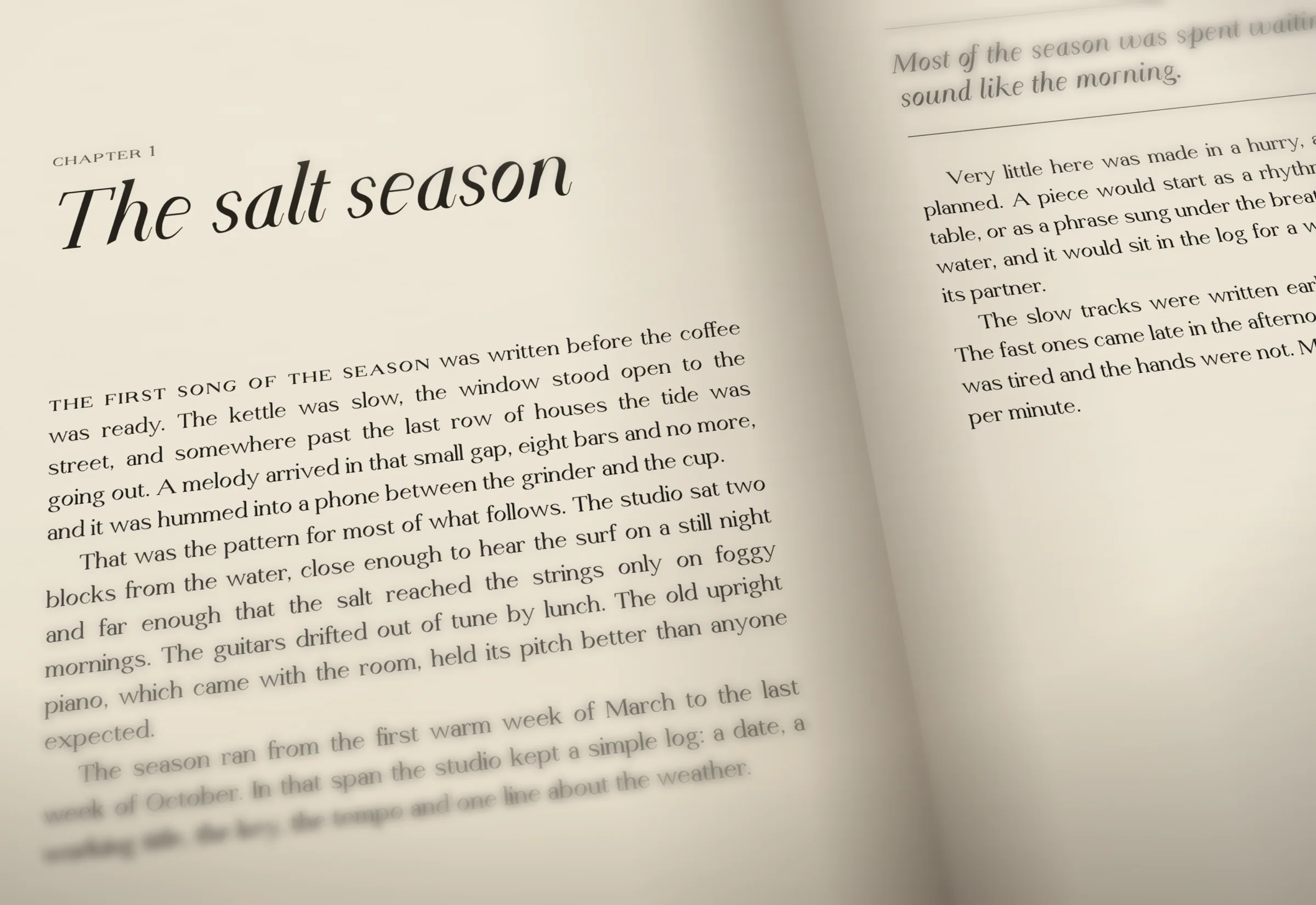
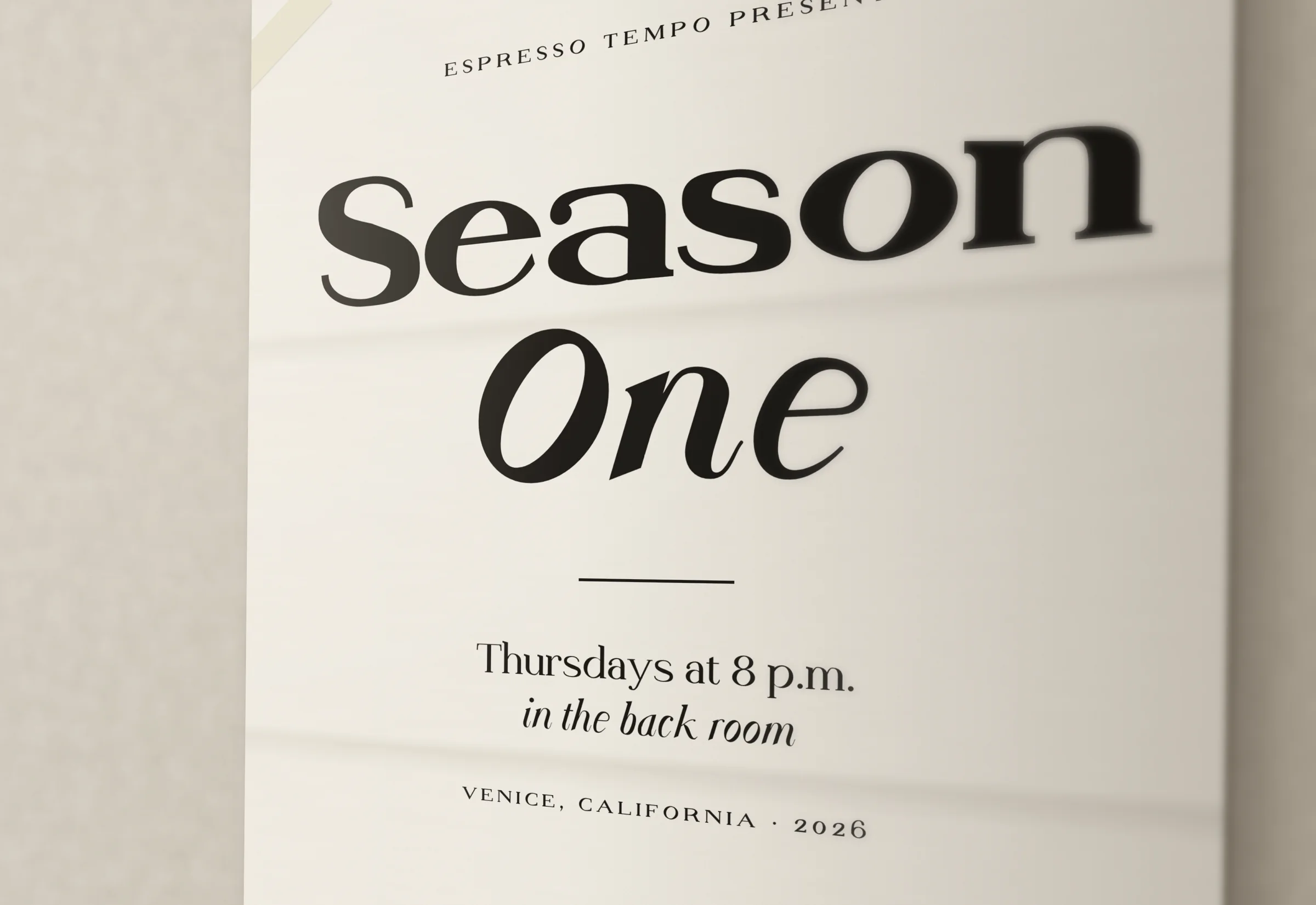
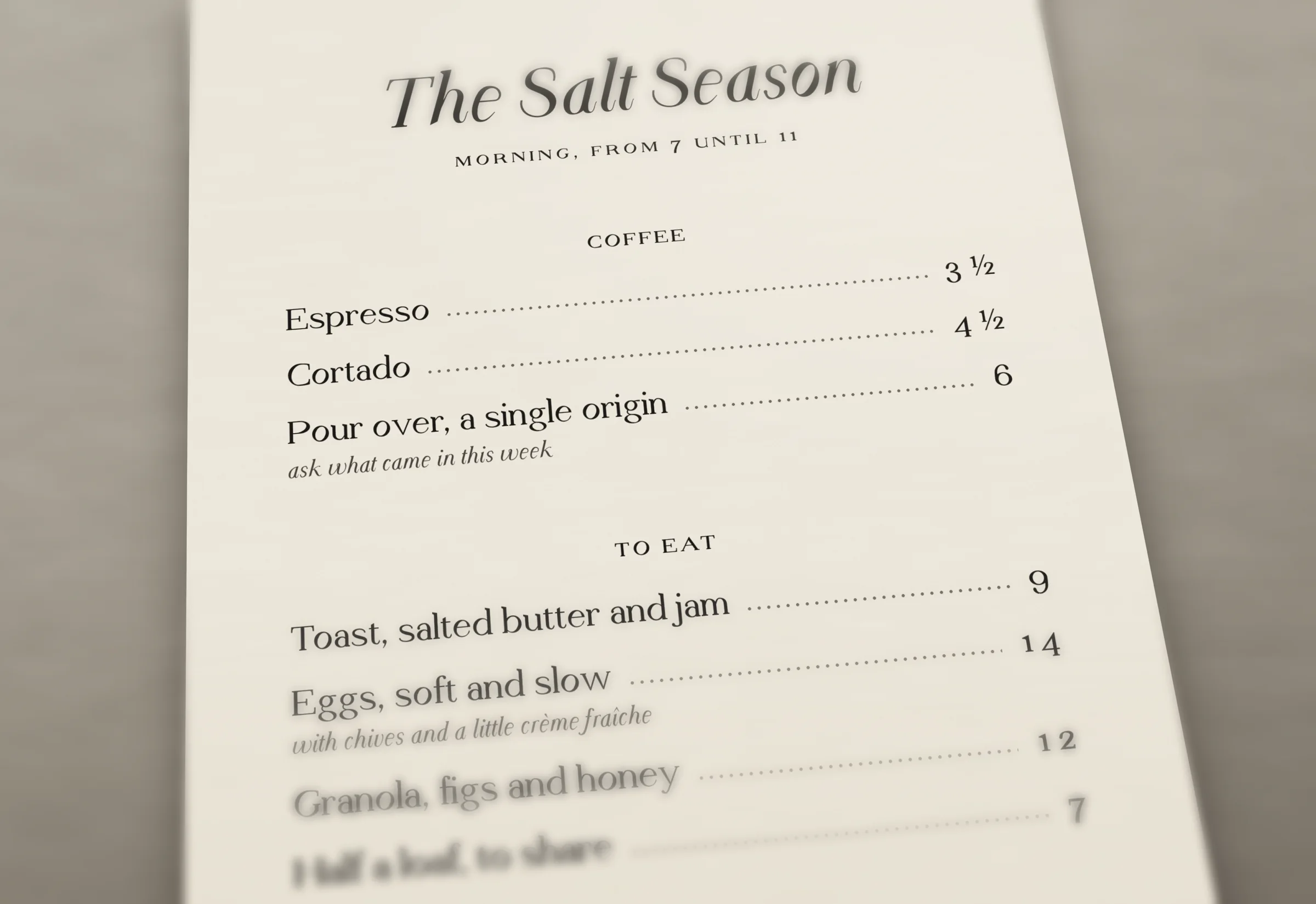
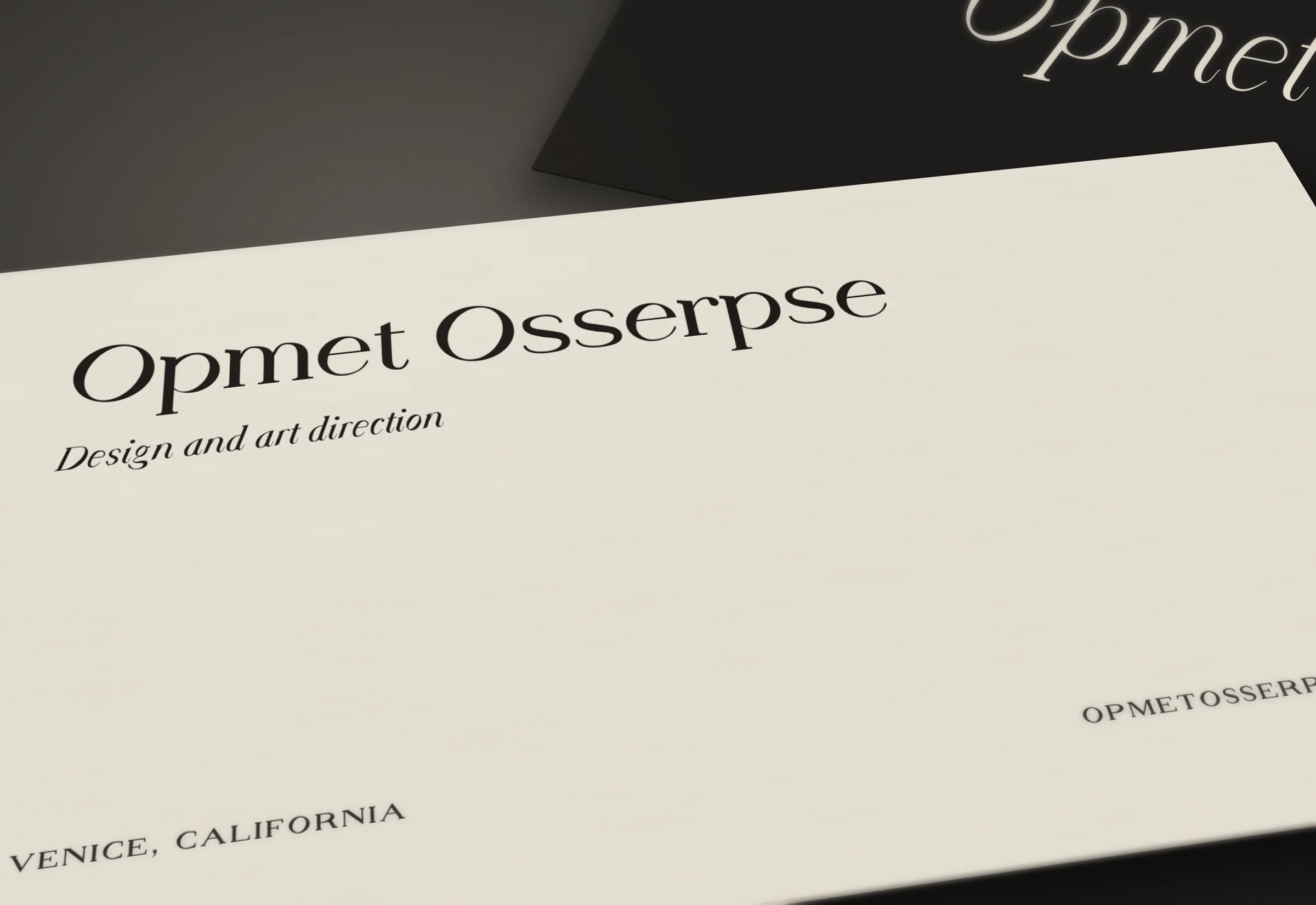
Two facing book pages set in Opmet Serif: a chapter opening in Display Italic, with justified text in Text Regular, small caps and a pull quote in italic. A book open on a desk, close: a chapter opening set in Opmet Serif, the title in Display Italic and the text in Text Regular, with small caps and oldstyle figures. A poster on a plaster wall: Season One in Display Black and Bold Italic, the details in small caps. A café menu on stone: the dishes in Text Regular, the prices in oldstyle figures with fractions, the notes in italic. Letterpress business cards for Opmet Osserpse: the name in Display Regular, the address in small caps.

What’s in it

36static styles, in OTF and in TTF hinted for Windows
2variable fonts, with weight and optical size axes
635glyphs in each, 438 of them characters
270languages written in the Latin alphabet
8local forms, from Dutch to Turkish
120layout tests passed in every font: small caps, figure sets, fractions, ligatures and marks

Opmet Serif 1.004. Design: Opmet Osserpse, Venice, California.