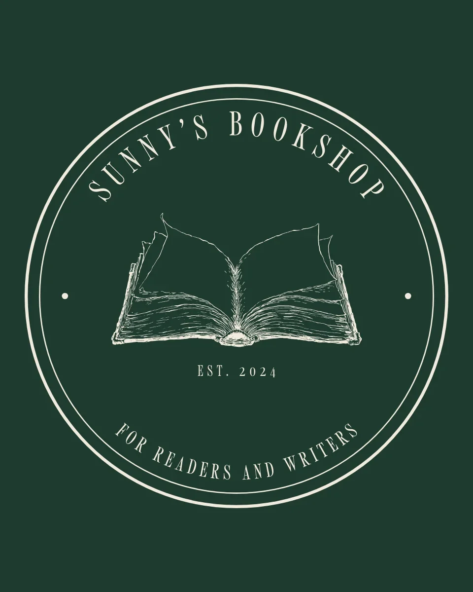
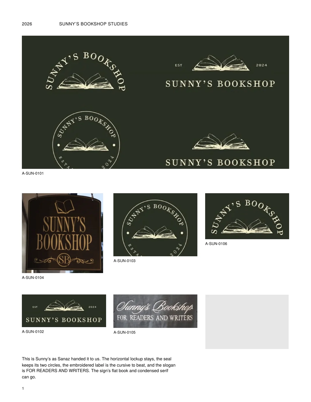
Sunny's Bookshop is an independent bookshop and book bar in Tarzana, with a second shop coming to the NoHo Arts District. I was the creative director on the full rebrand and the logo, all of it built for the new store. The owner, Sanaz Tamjidi, already had a brand people loved: a seal, a cursive signature, a dark green. She asked for it refined, not reinvented. So I drew the open book by hand, rebuilt the signature to be read rather than admired, set an SB monogram inside the seal's two rings, paired a serif with the script, and wrote the rules into a 24-page bible. The slogan was already stitched into her label: For readers and writers.
The book
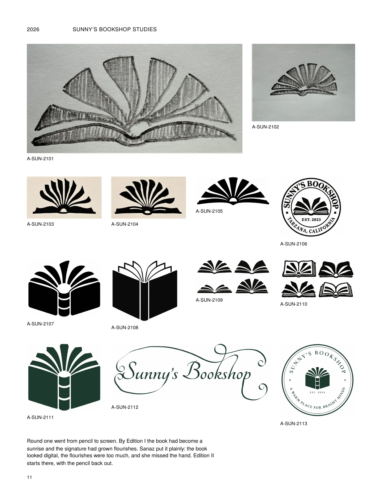
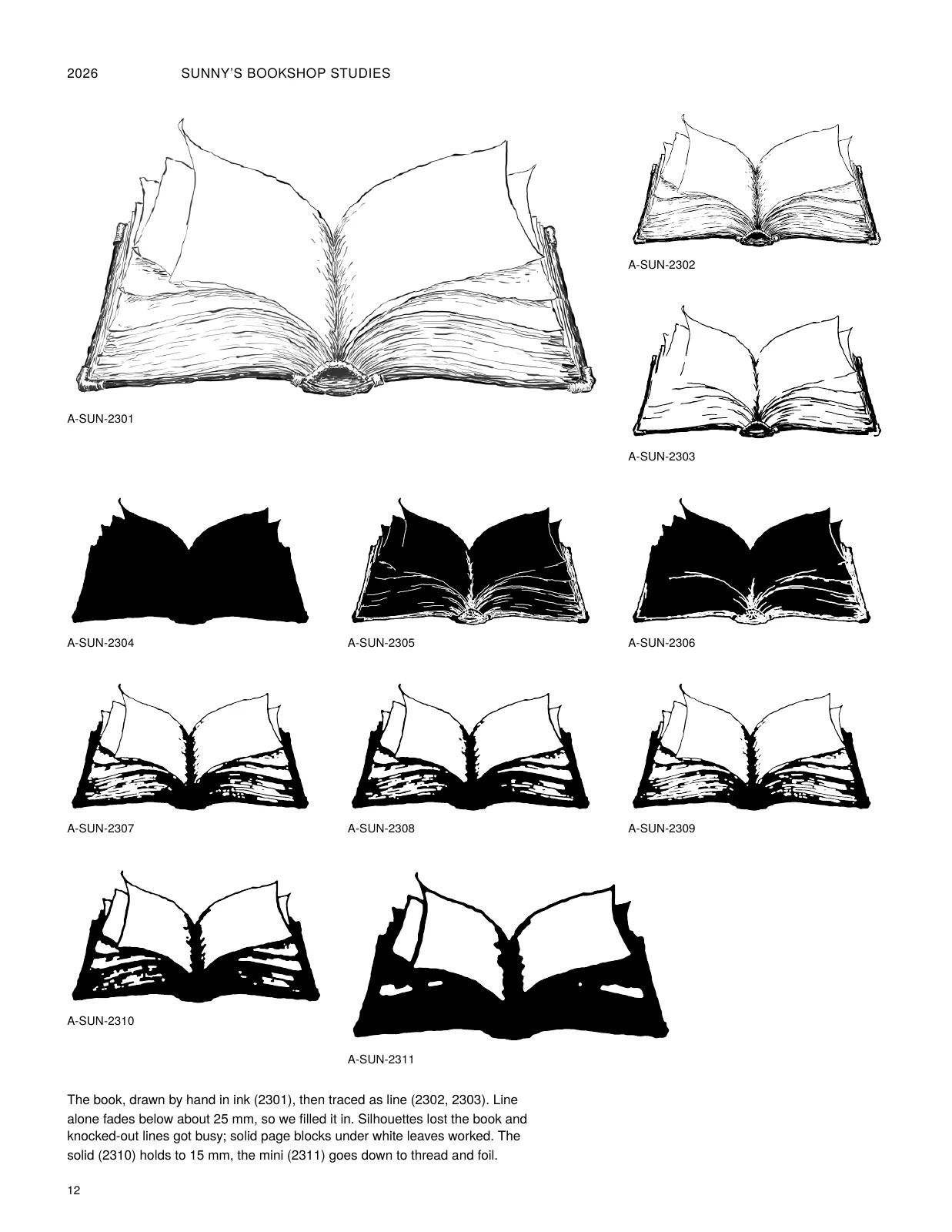
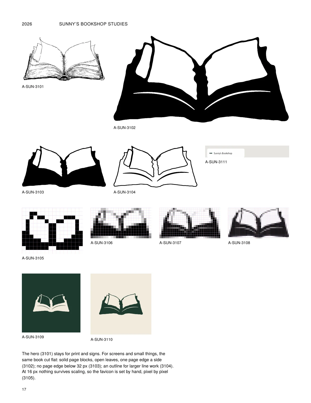
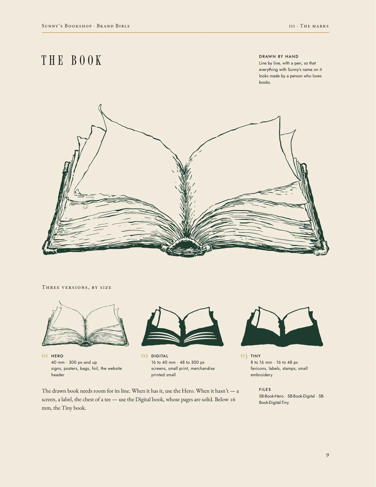
Drawn in ink first, then cut down to a solid version that still reads at the size of a favicon.


The seal and the monogram


The signature
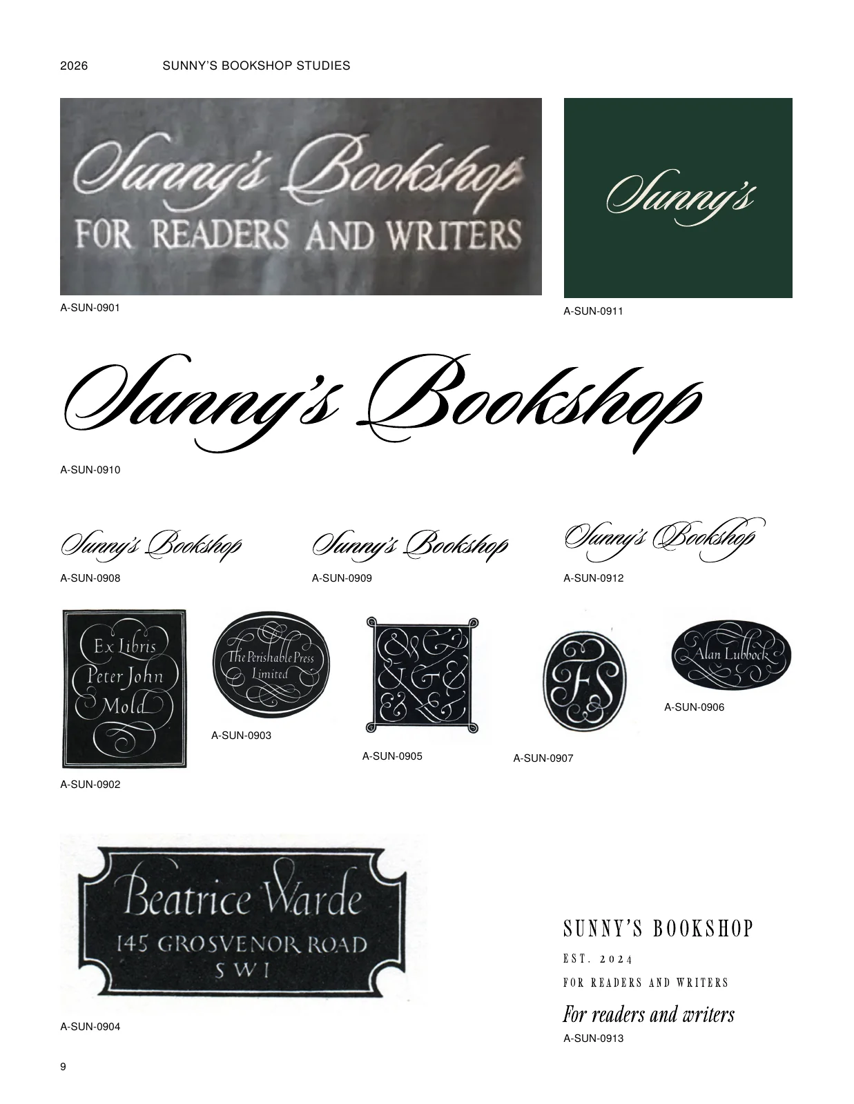
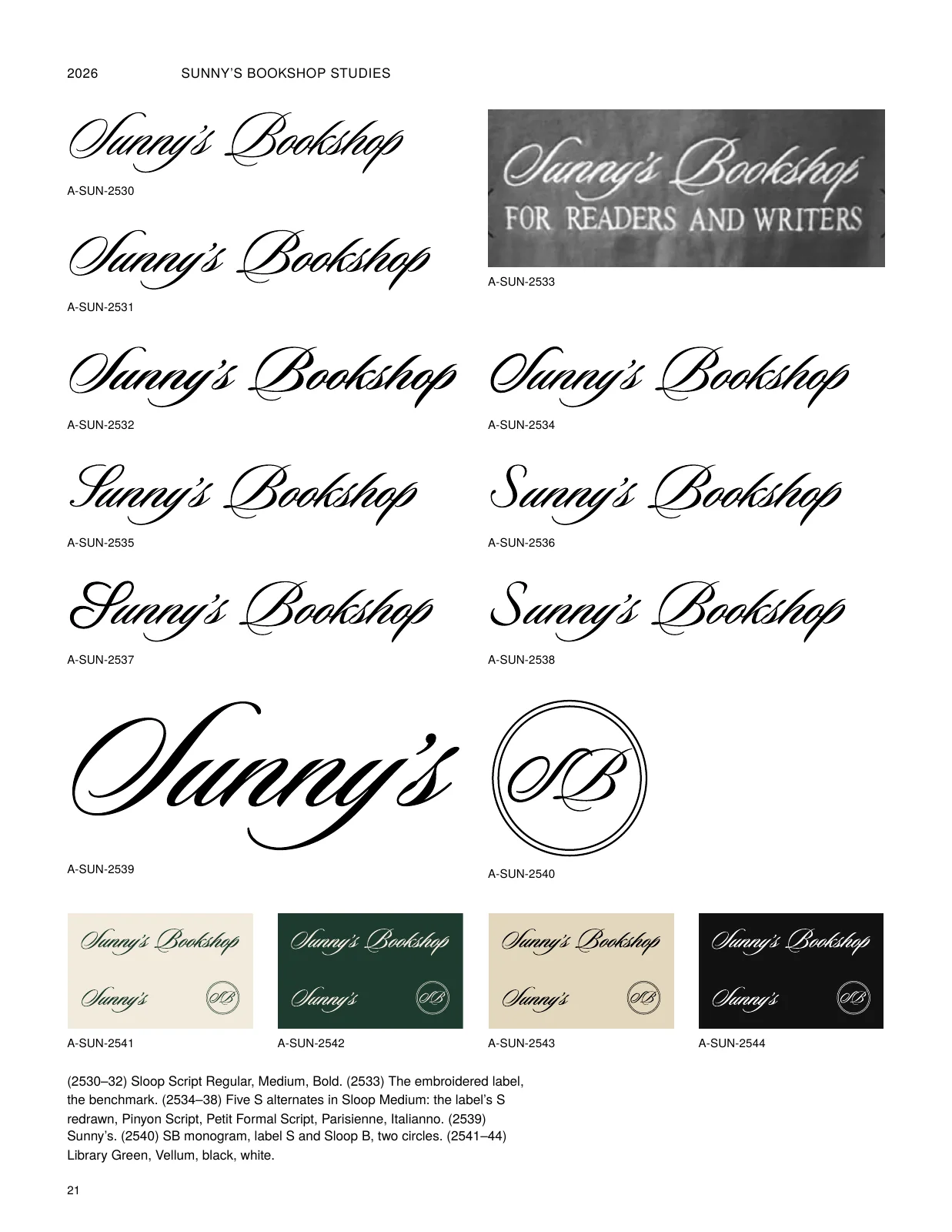
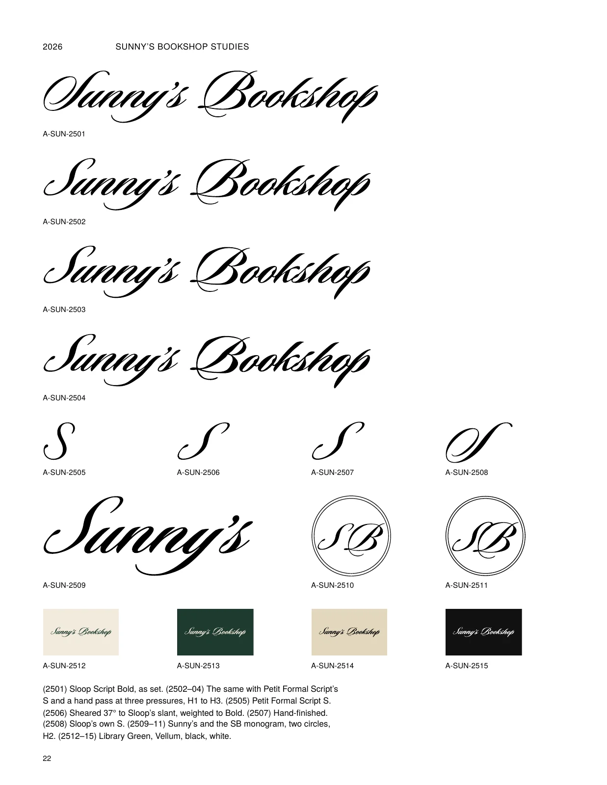
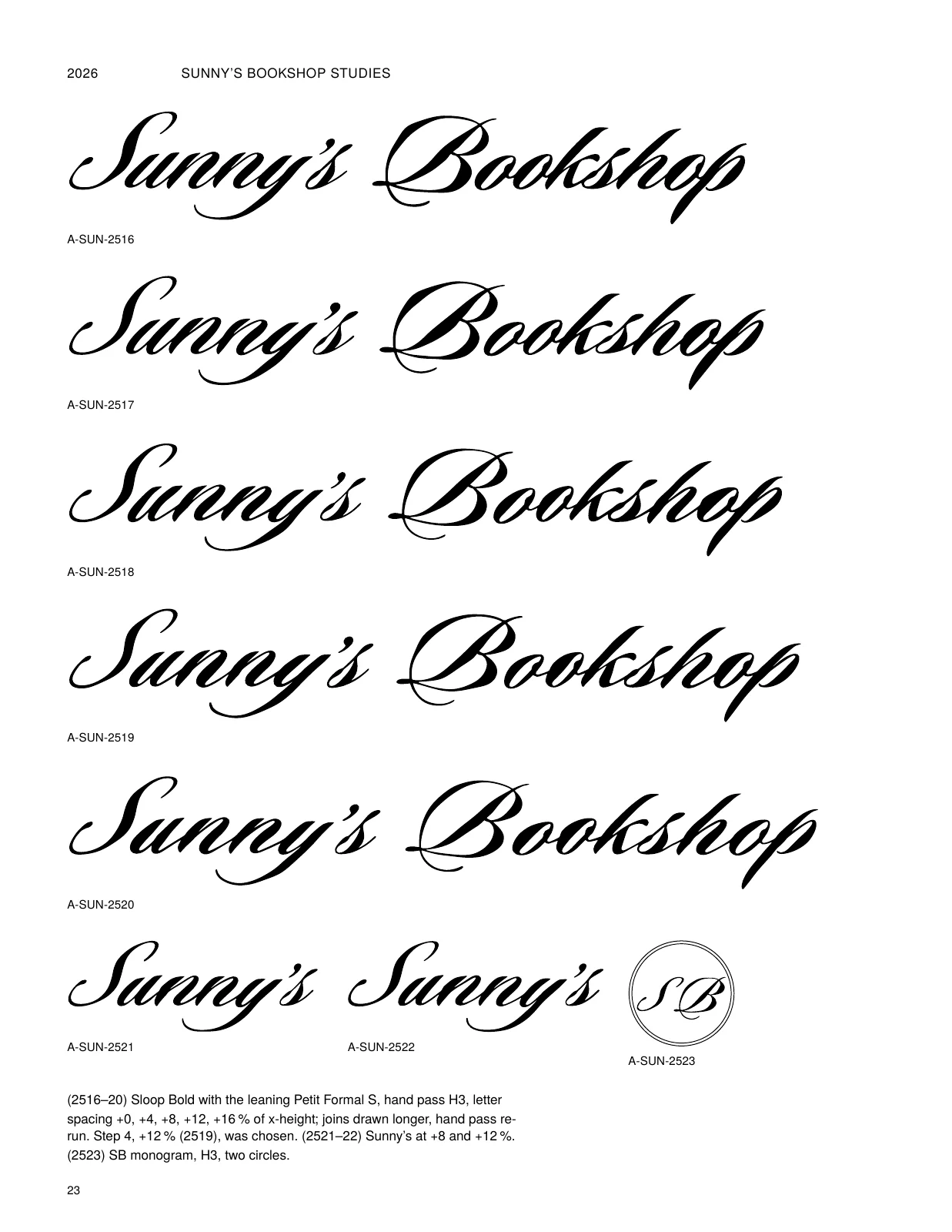
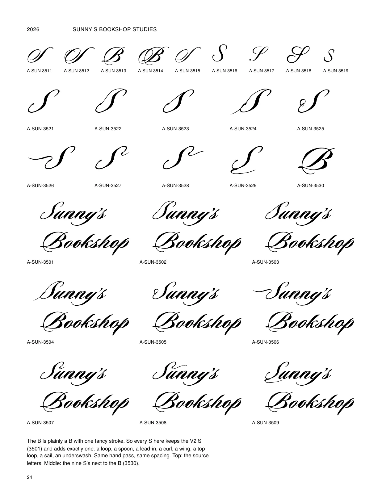
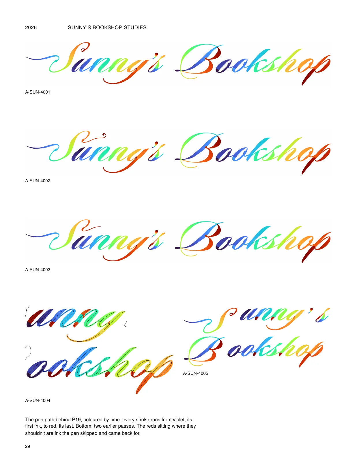
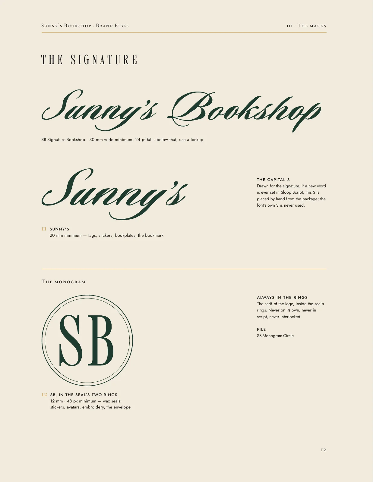
Sloop Script, tidied for legibility, with a custom S and the flourishes politely declined.

The system


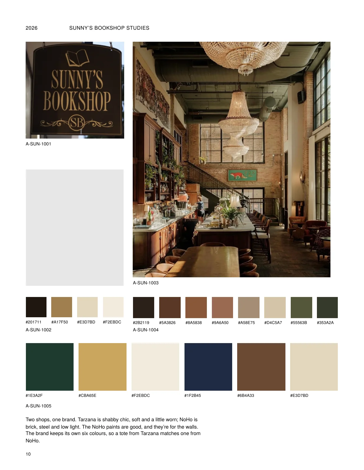
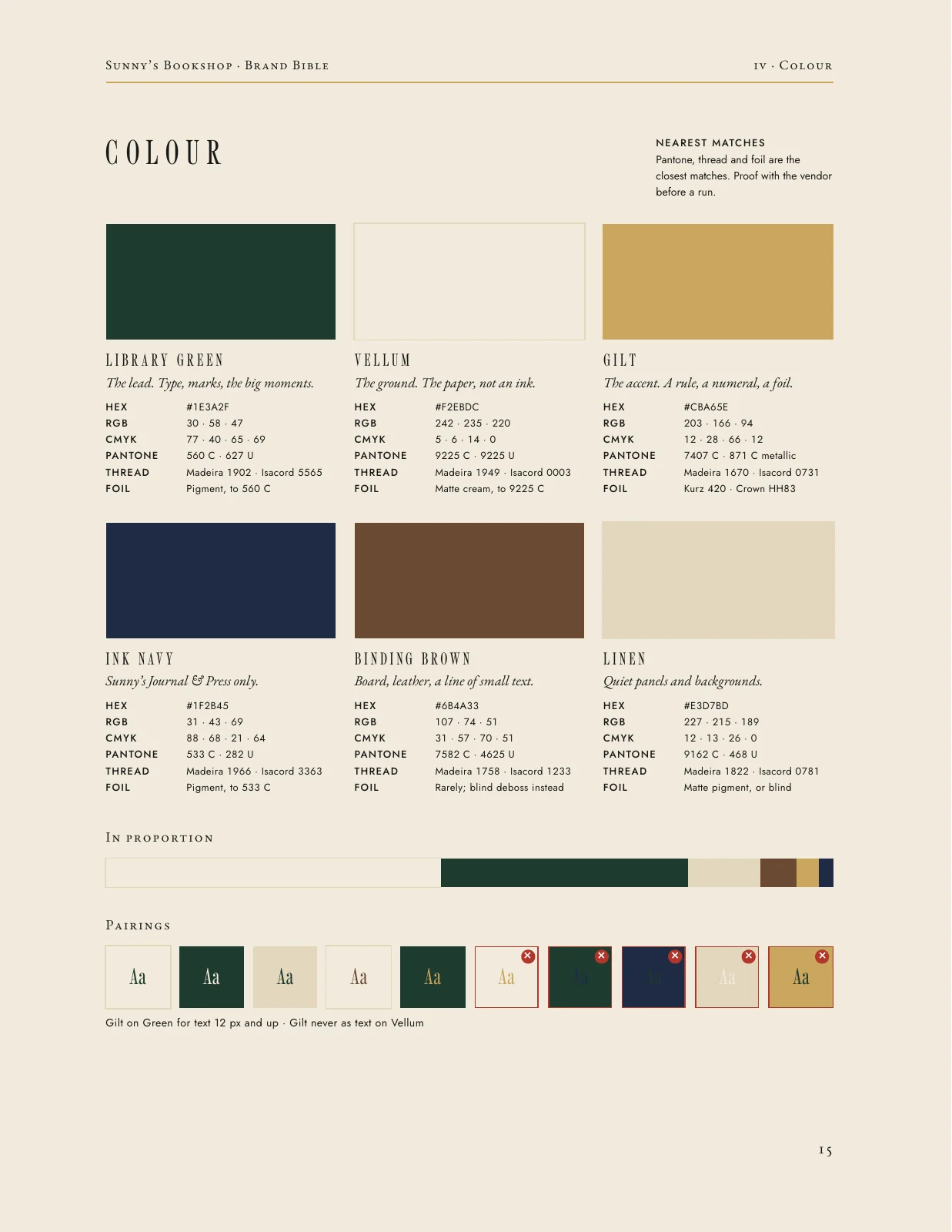
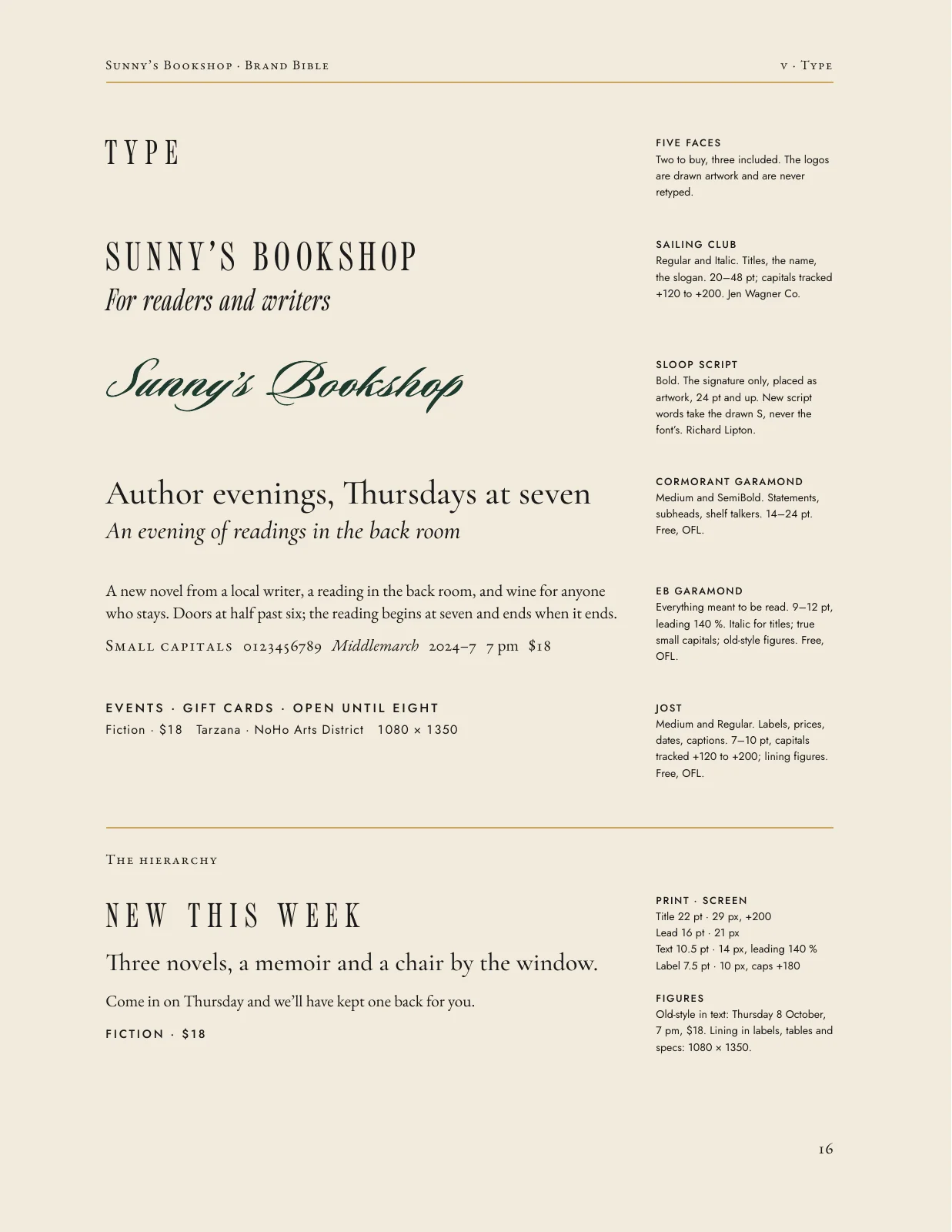
Type and colour


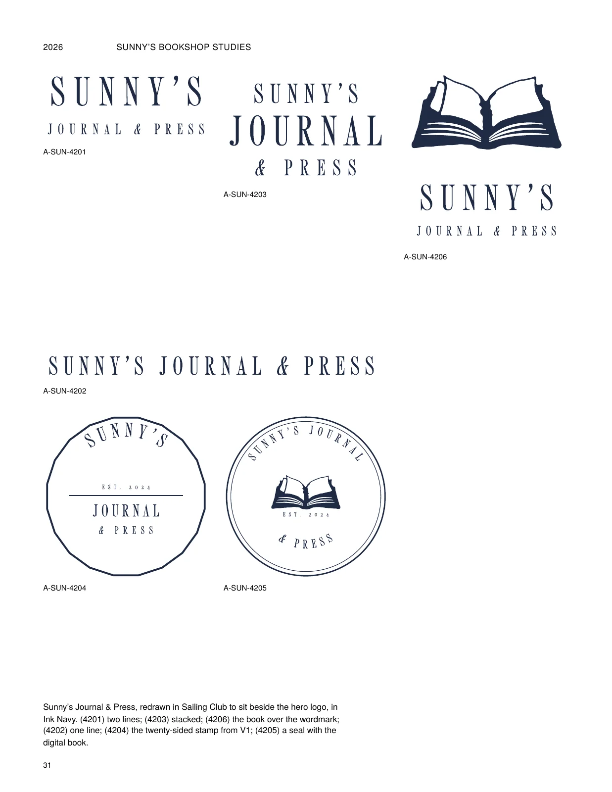
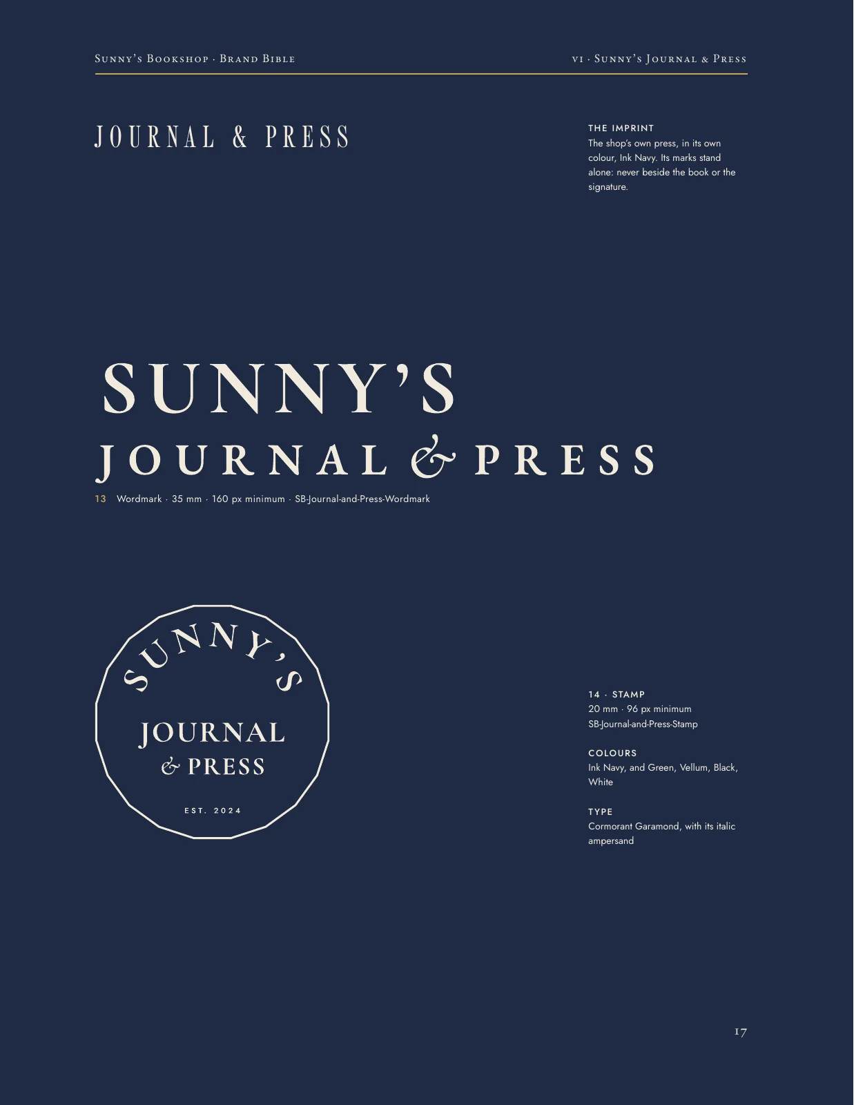
Sunny's Journal & Press


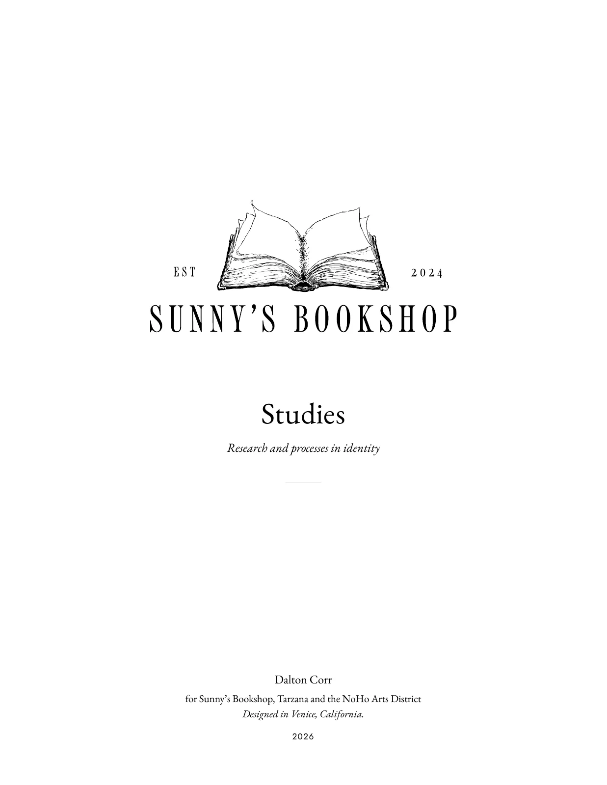
The studies
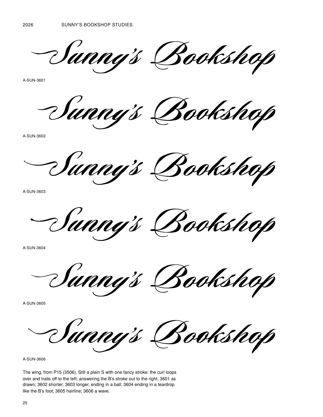
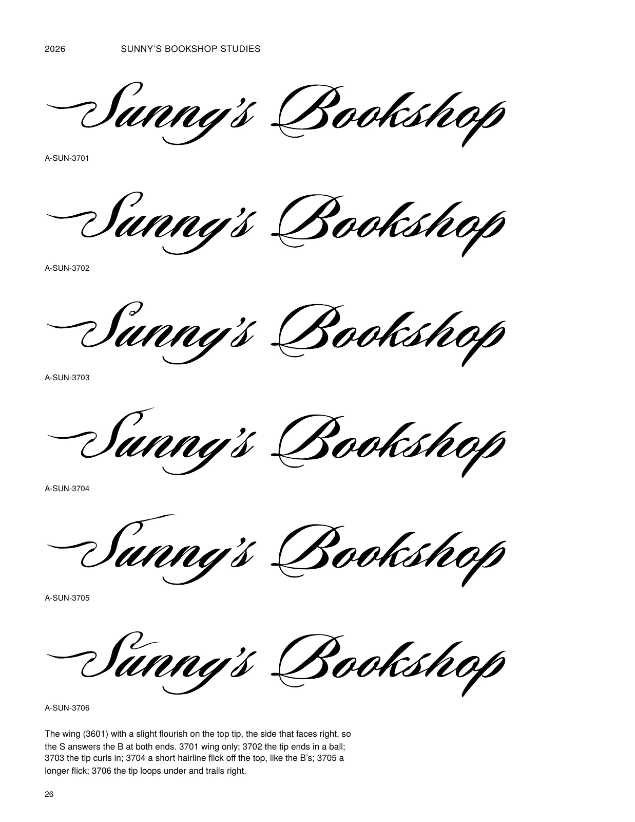
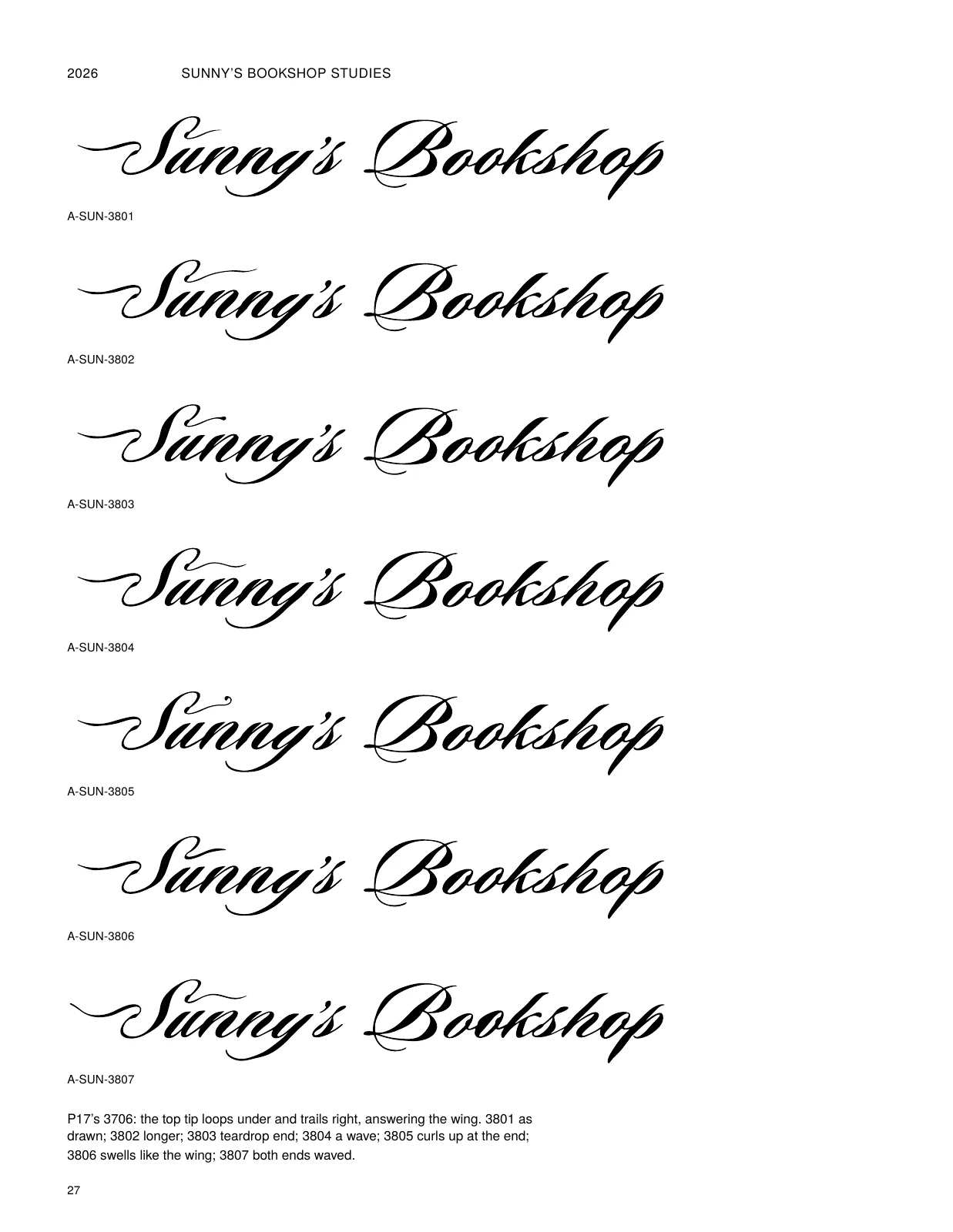
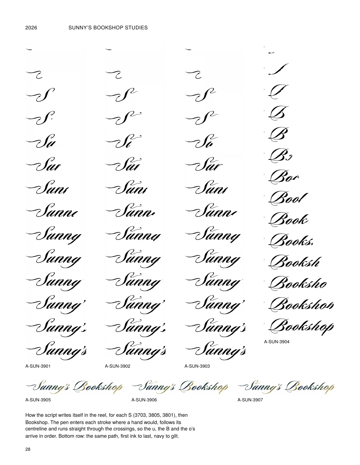
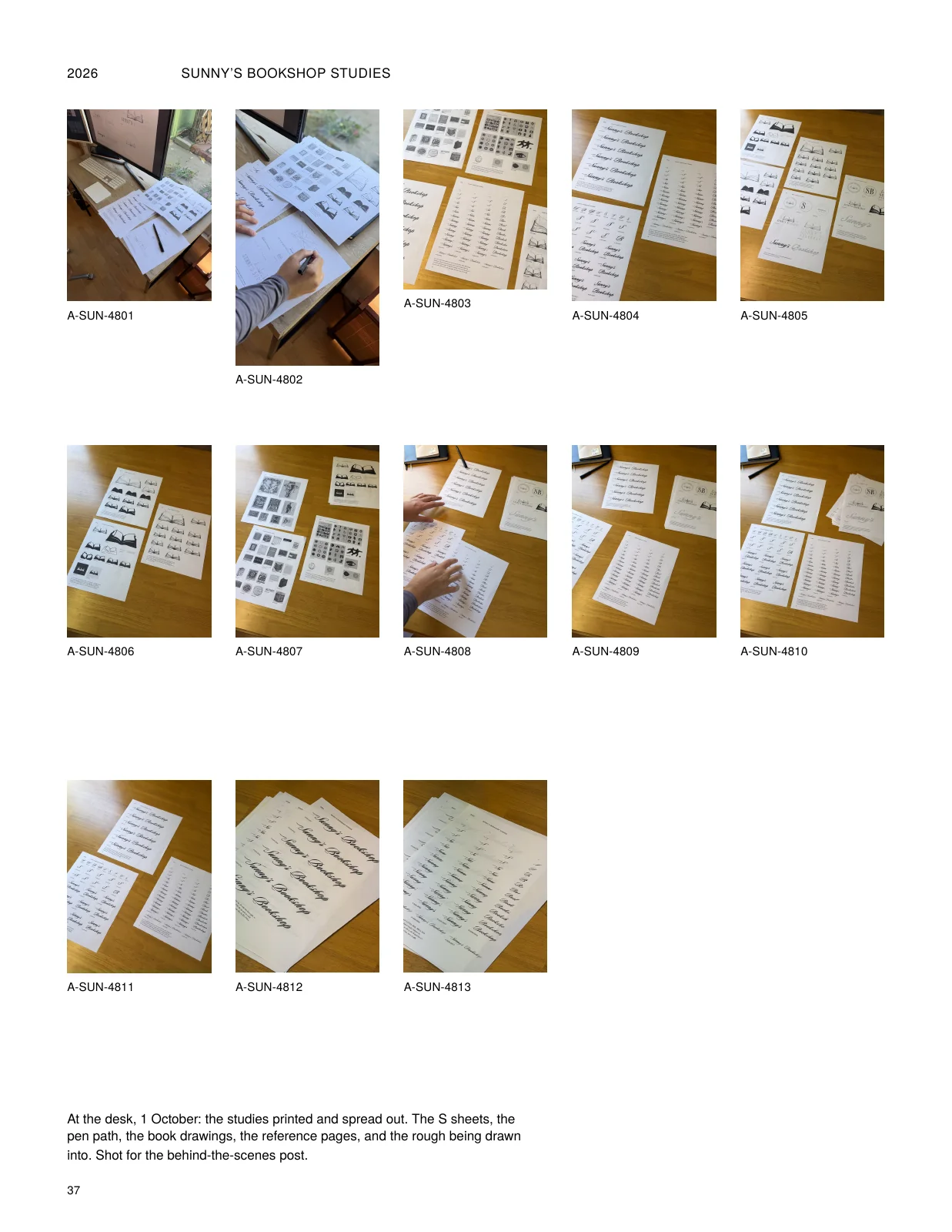
The working archive, every sheet in order: the research, the book variations, the S that nearly happened, the pen paths.


The studies, 46 pages
View all pages
- Title page · Studies, title page
- i · References and credits I: research
- ii · References and credits II: process
- 1 · The shop as it is
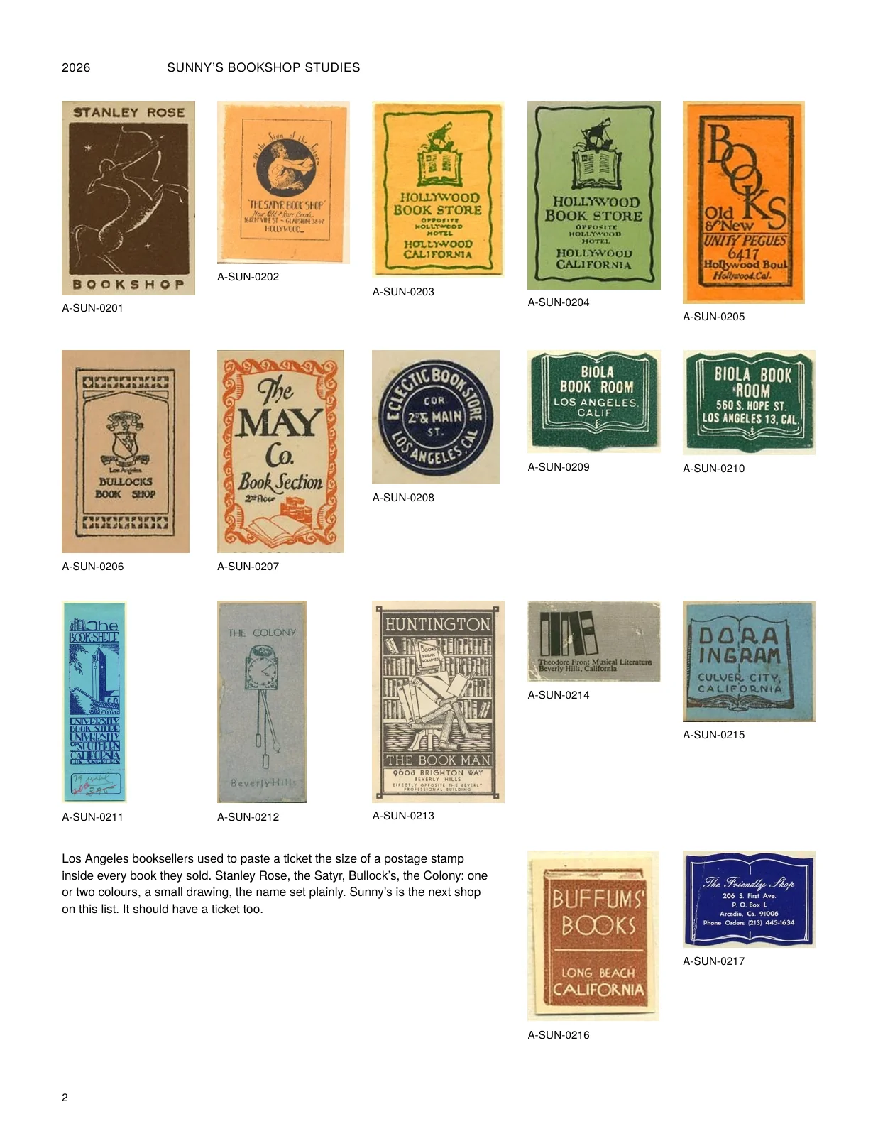
- 2 · Bookseller tickets I: the Los Angeles lineage
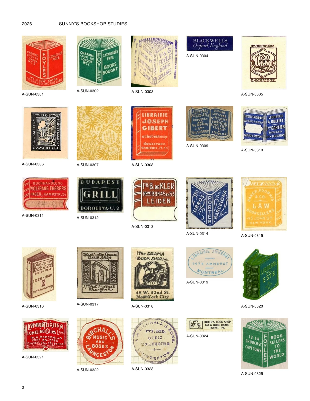
- 3 · Bookseller tickets II: Britain, Europe, America
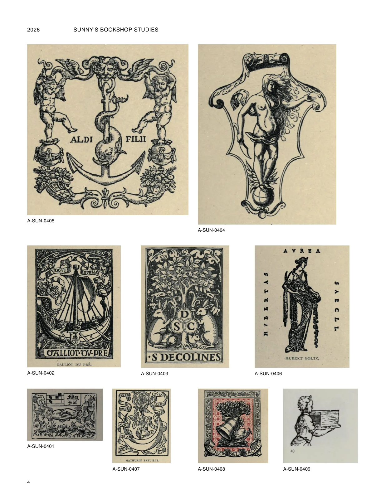
- 4 · Printer's marks and devices
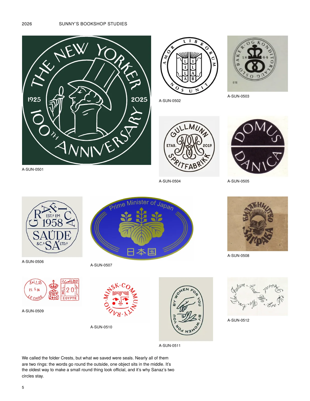
- 5 · Crests and heraldry
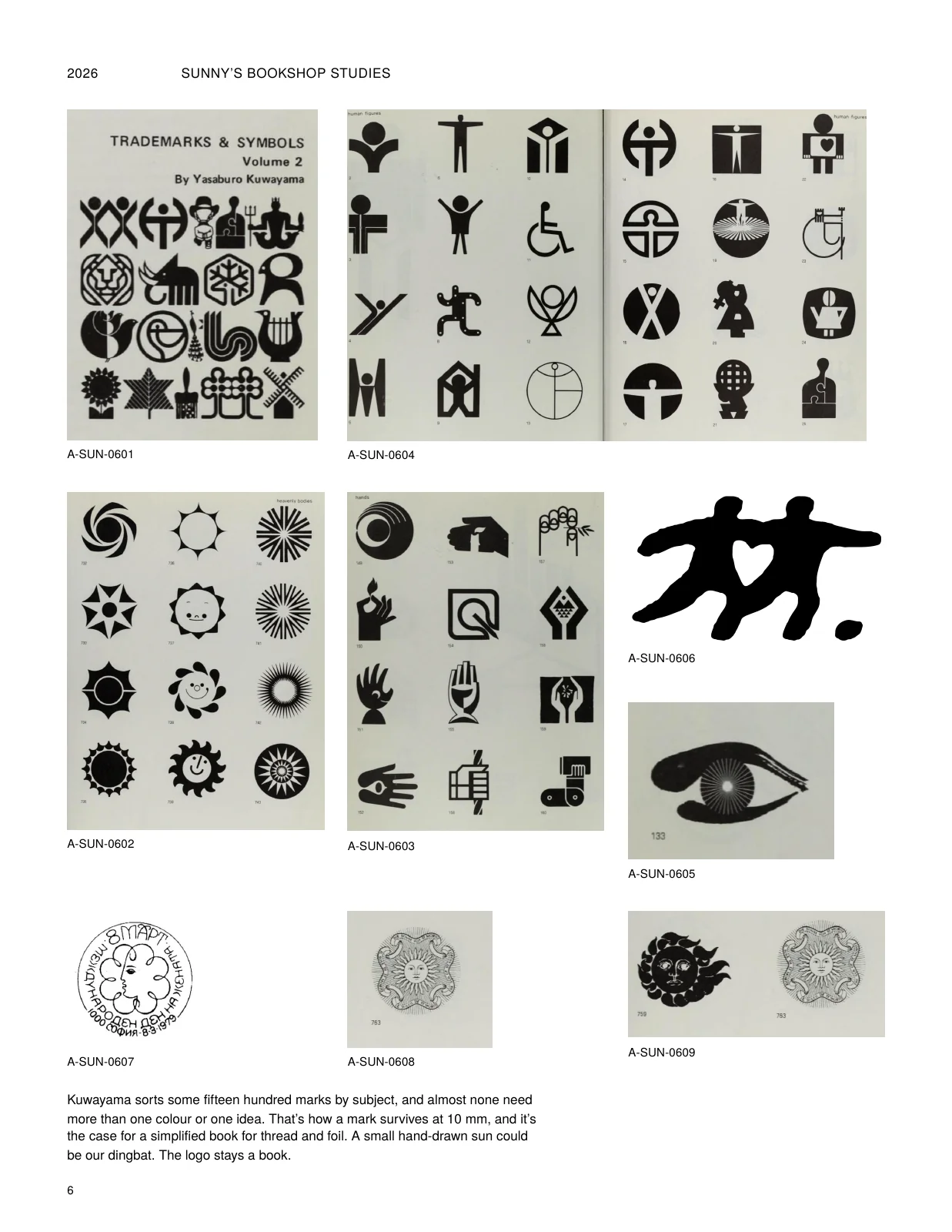
- 6 · Trademarks & symbols
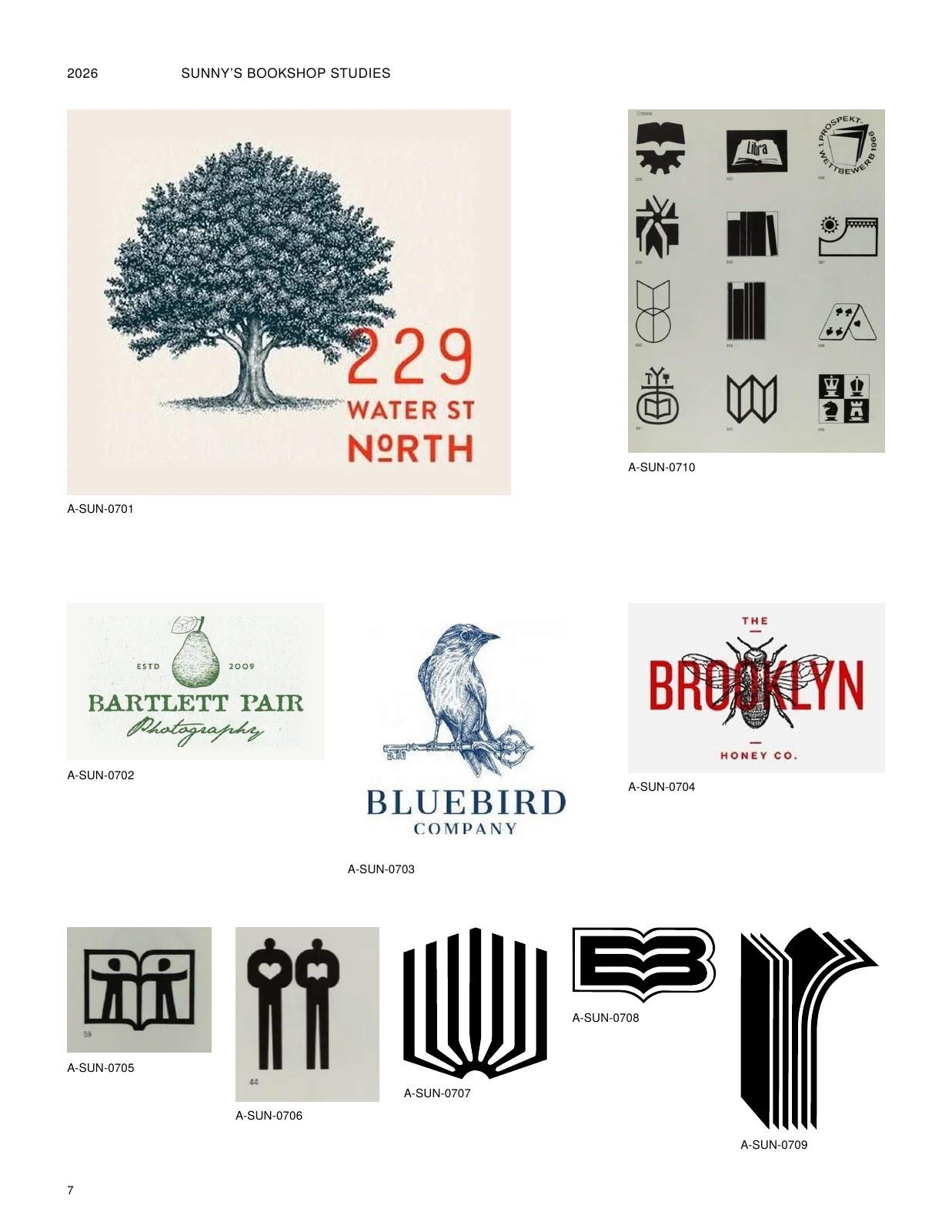
- 7 · Vintage sketch logos
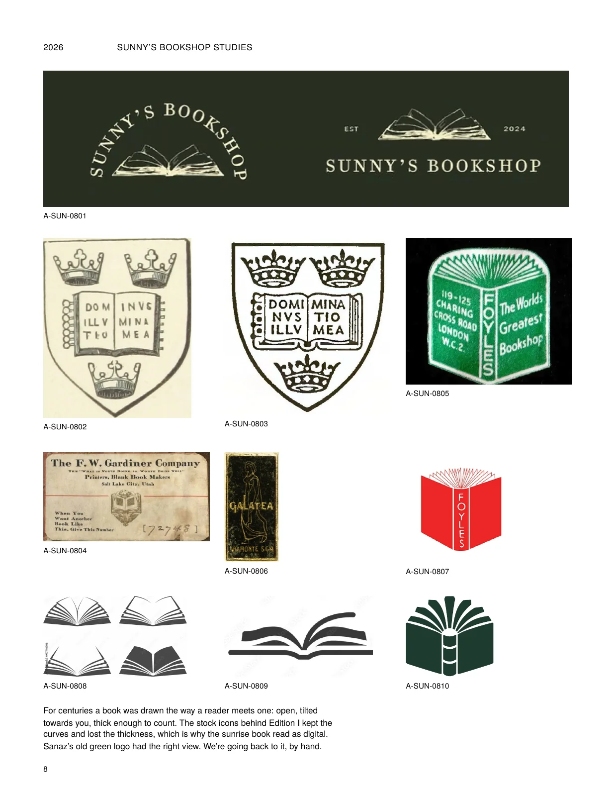
- 8 · How books have been drawn
- 9 · Script and wordmark studies
- 10 · Two stores, two moods
- 11 · Round one and V1, what we learned
- 12 · From sketch to solid
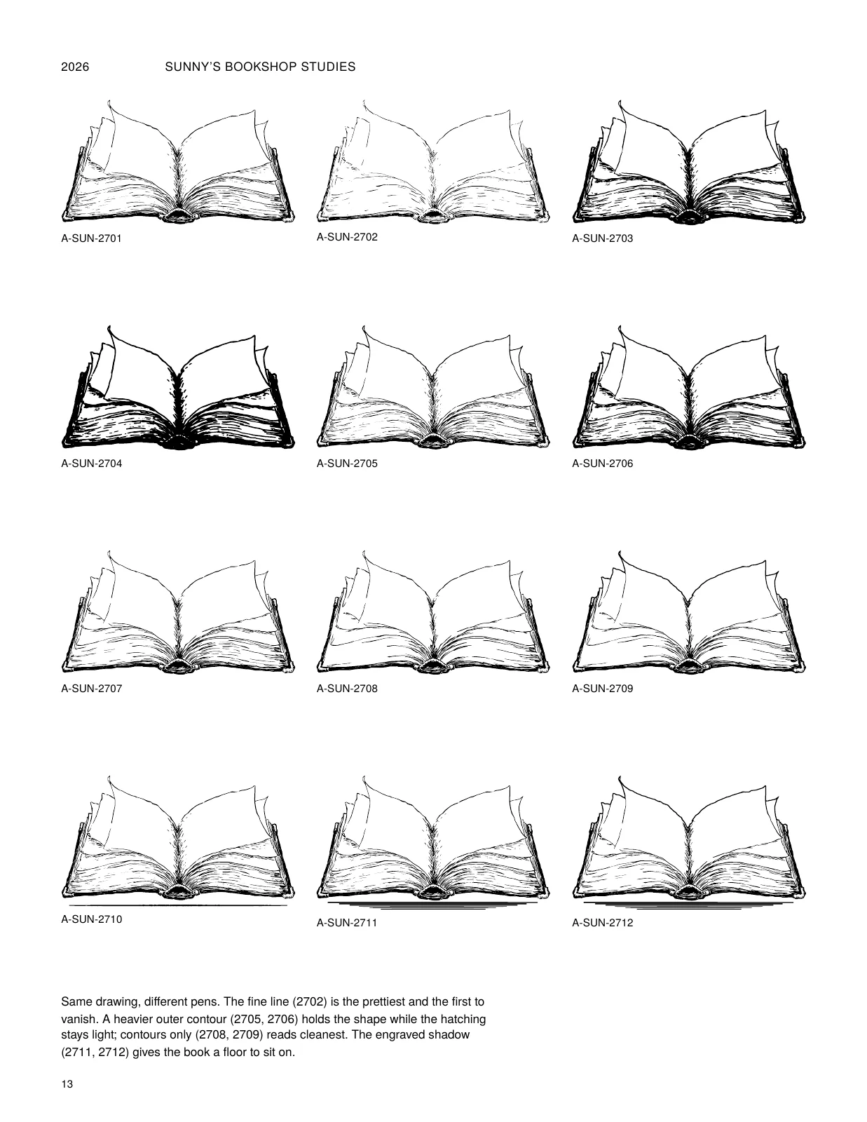
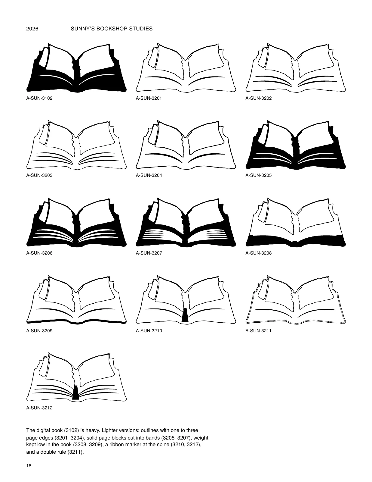
- 13 · Book variations I: line and weight
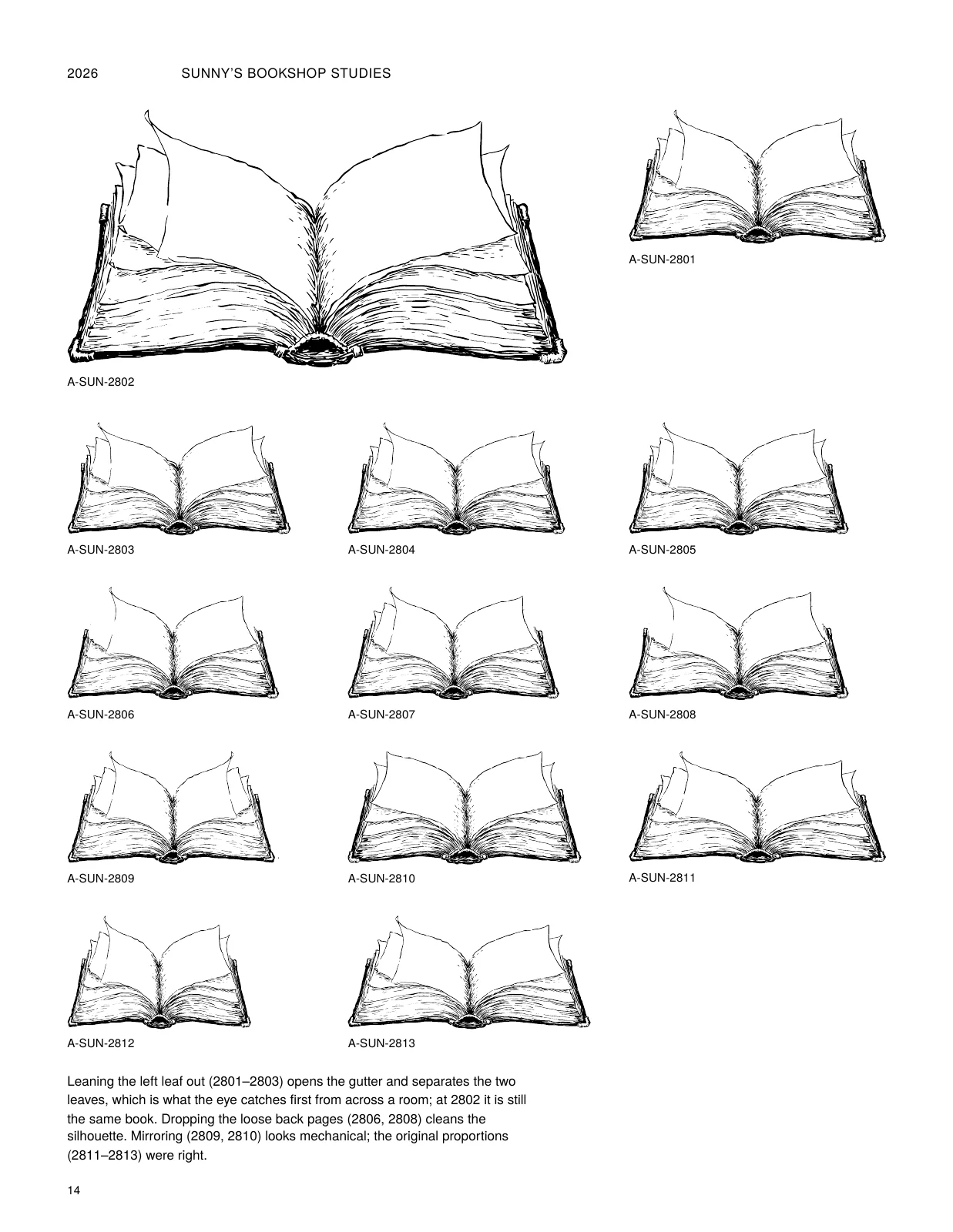
- 14 · Book variations II: openness and shape
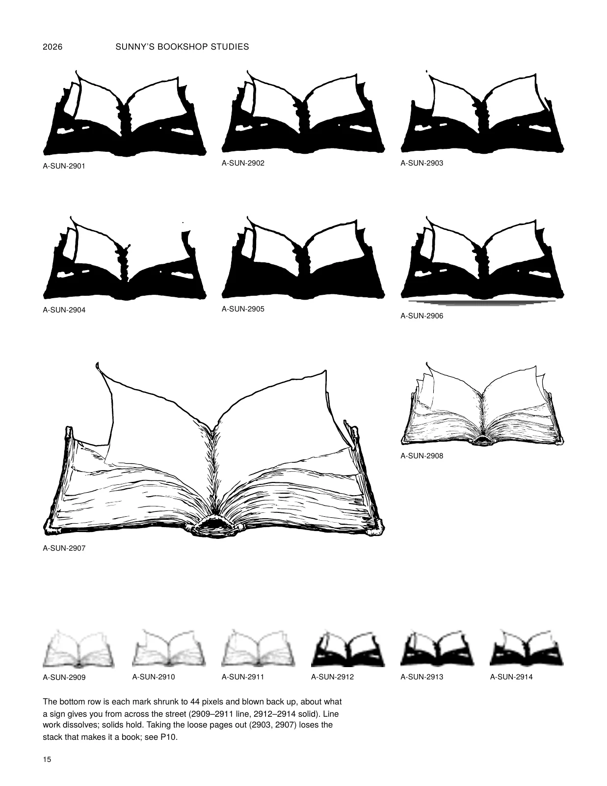
- 15 · Book variations III: solid and distance
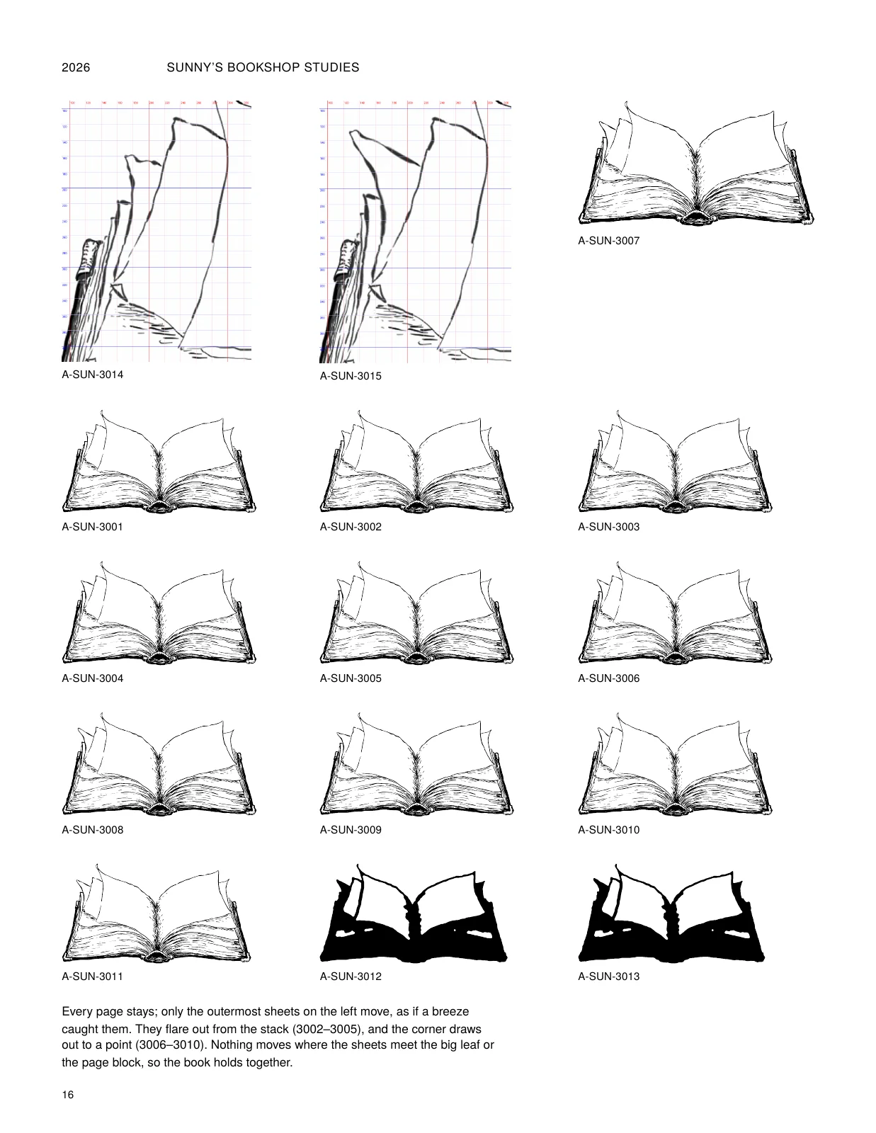
- 16 · The breeze
- 17 · The miniature
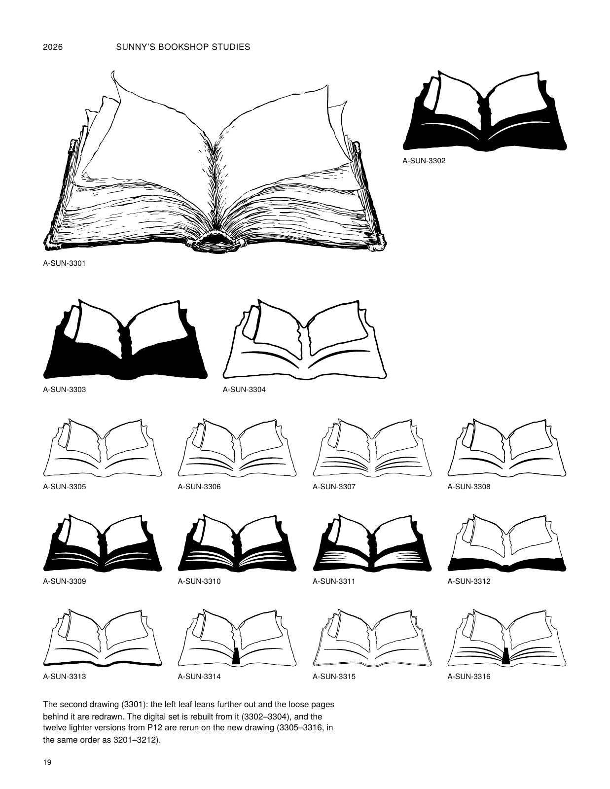
- 18 · The miniature, lighter
- 19 · The miniature, second drawing
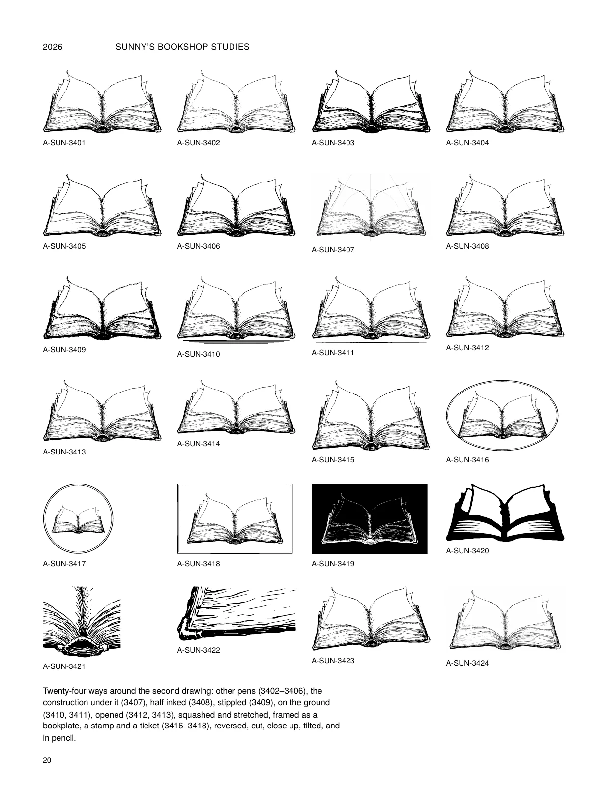
- 20 · The book, sketchbook
- 21 · Signature studies I
- 22 · Signature studies II
- 23 · Signature spacing
- 24 · The S
- 25 · The wing
- 26 · The wing and the tip
- 27 · The two wings
- 28 · Writing it on
- 29 · The pen path
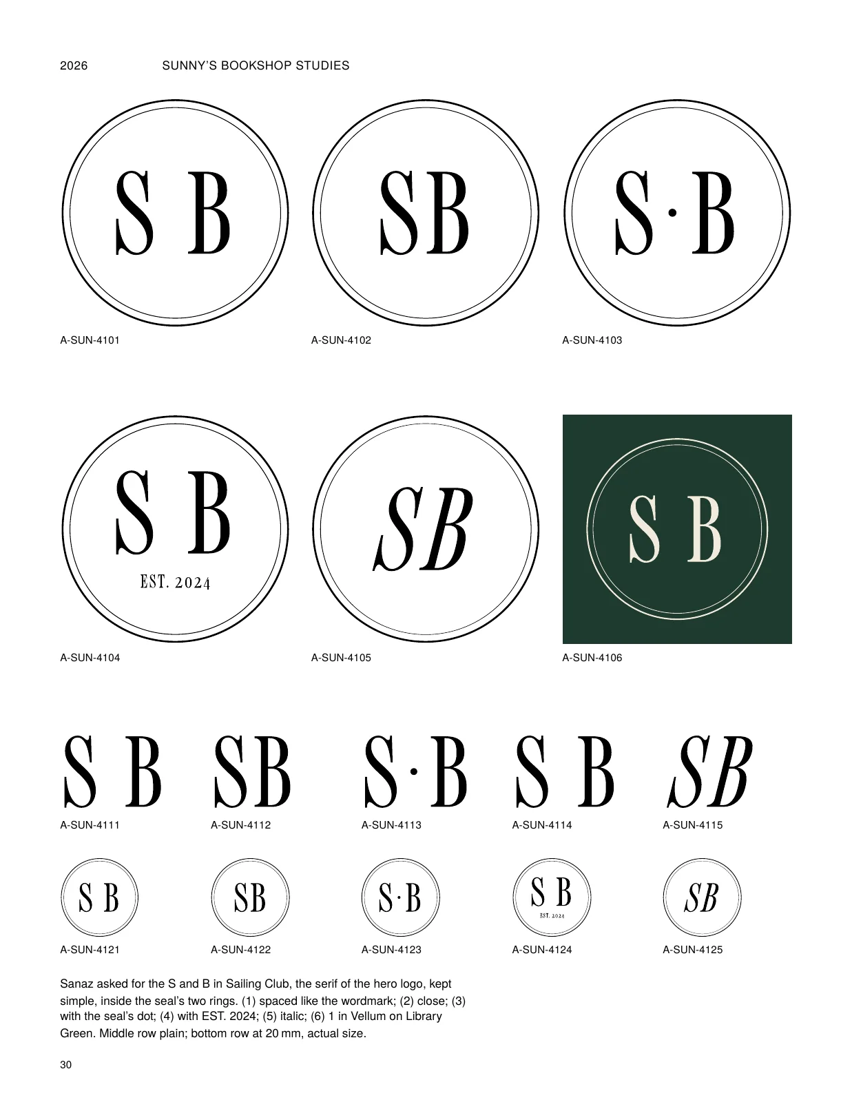
- 30 · The serif monogram
- 31 · Sunny's Journal & Press
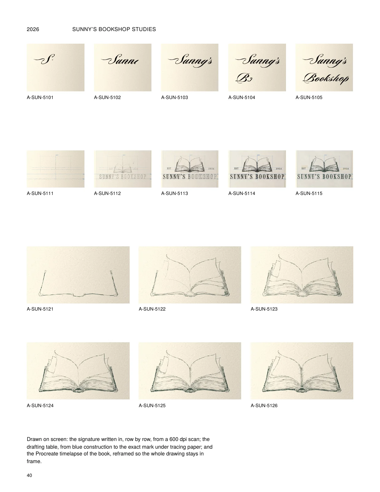
- 32 · The logo, drawn
- 33 · The drafting table
- 34 · Half inked
- 35 · Two to print
- 36 · The rough
- 37 · At the desk
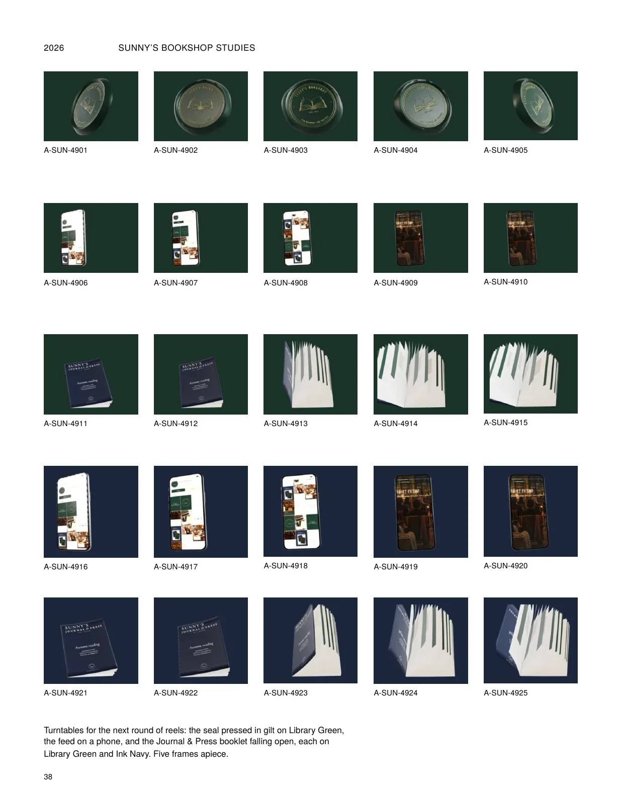
- 38 · Motion graphics
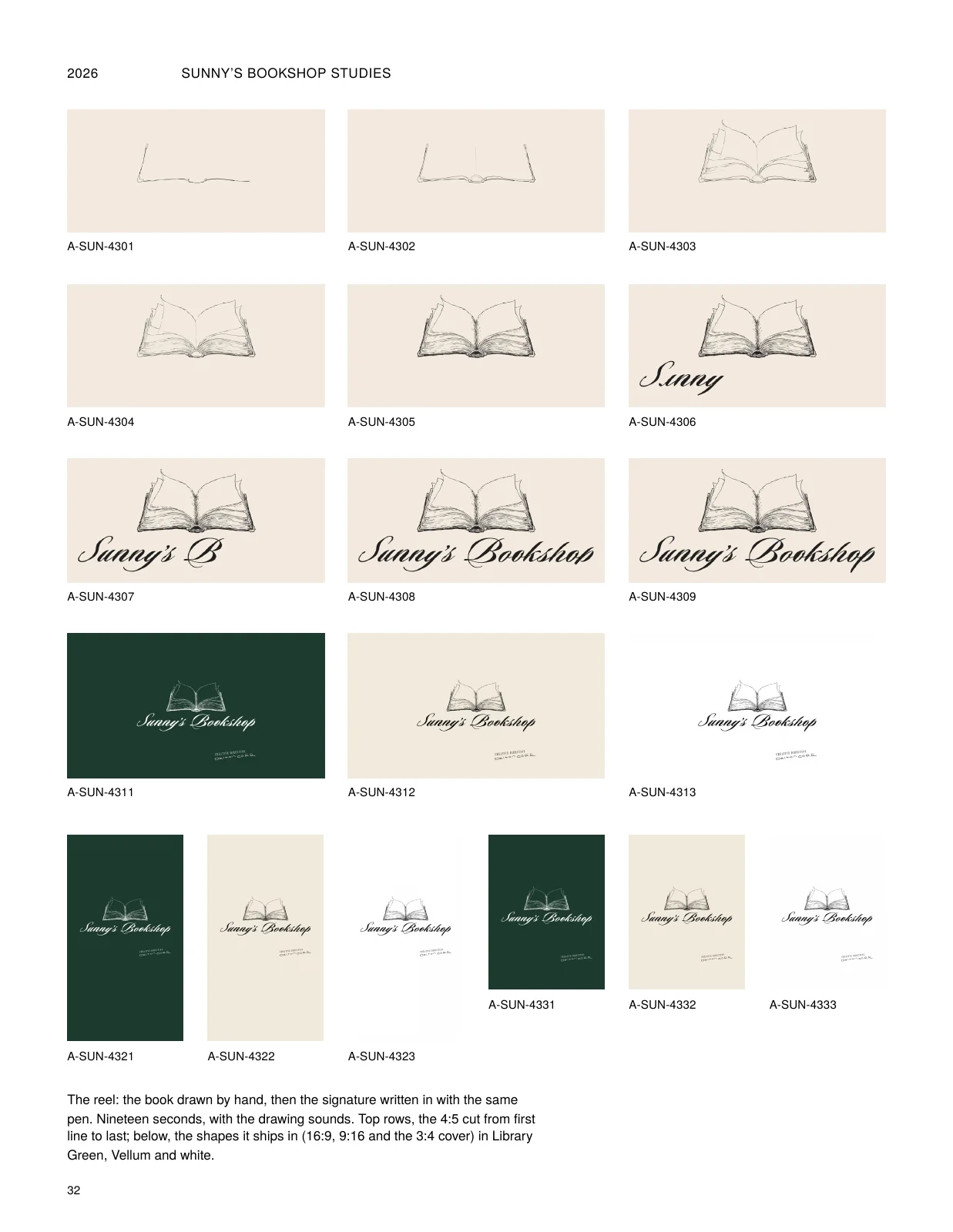
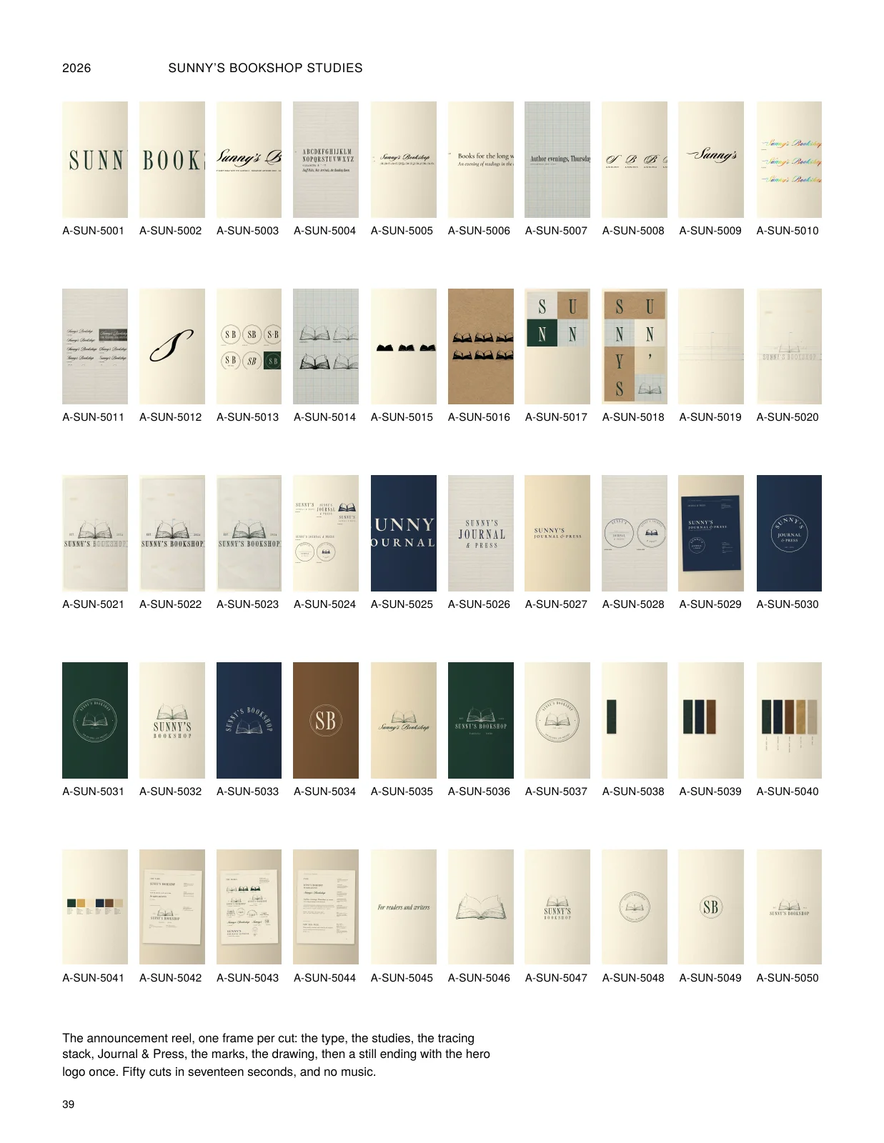
- 39 · The reel, cut by cut
- 40 · Drawn and traced, in motion
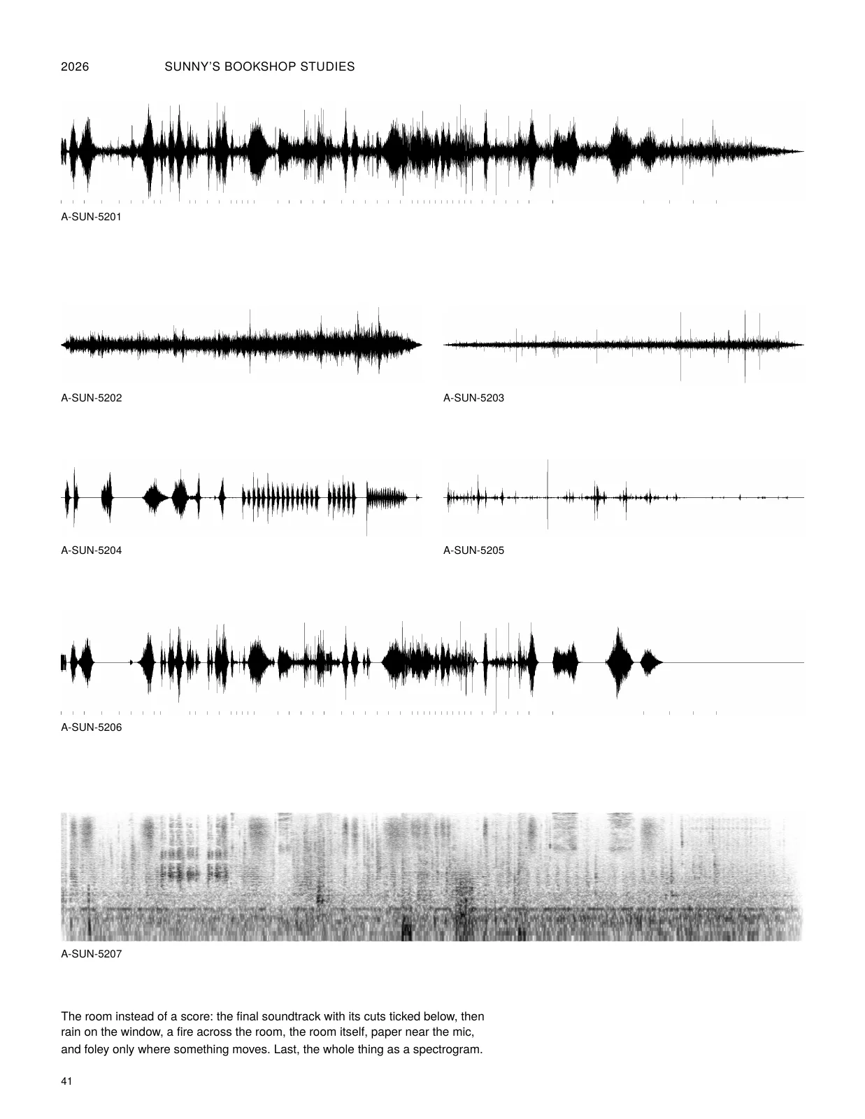
- 41 · The room
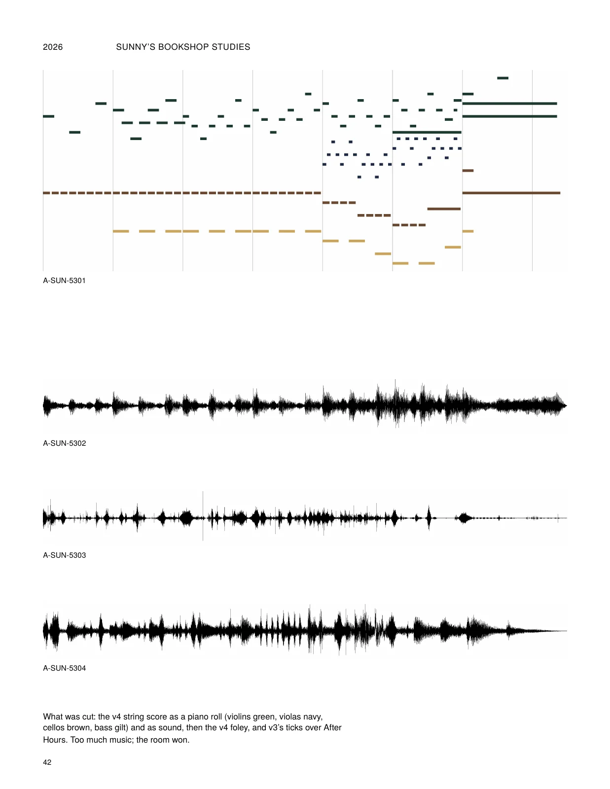
- 42 · The score that was cut
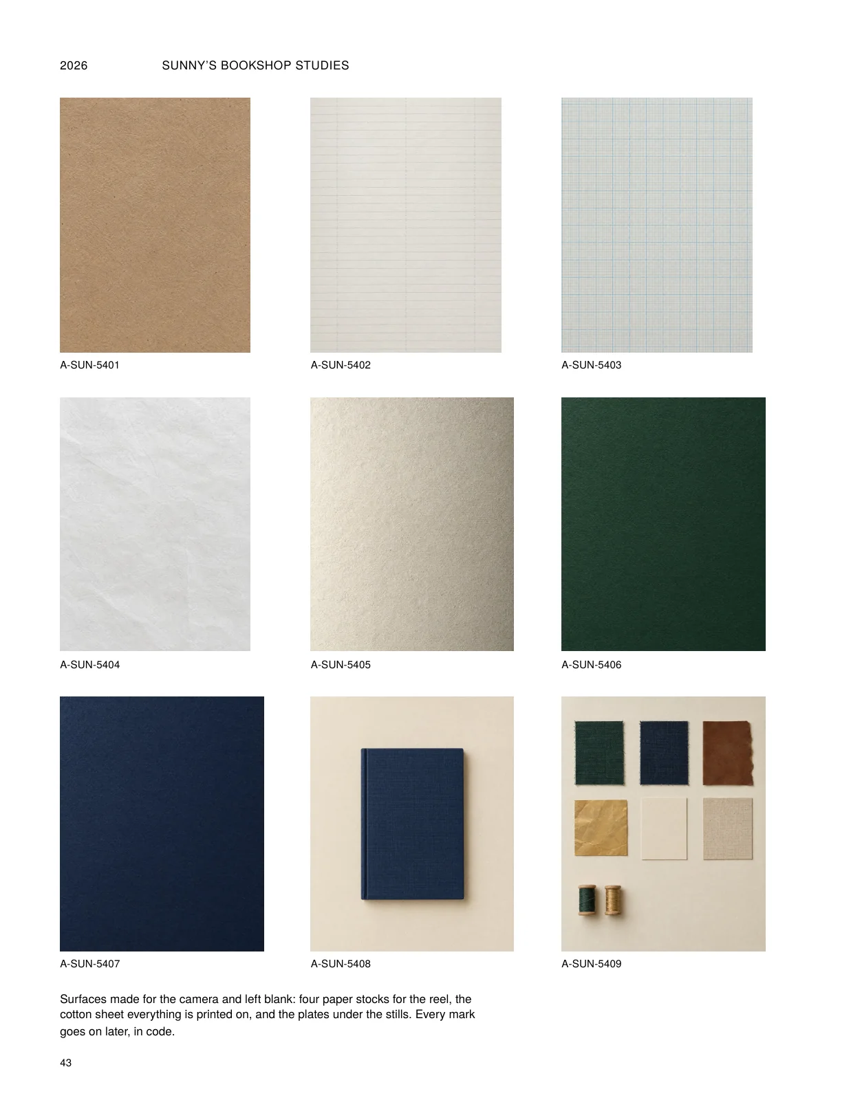
- 43 · Paper and plates
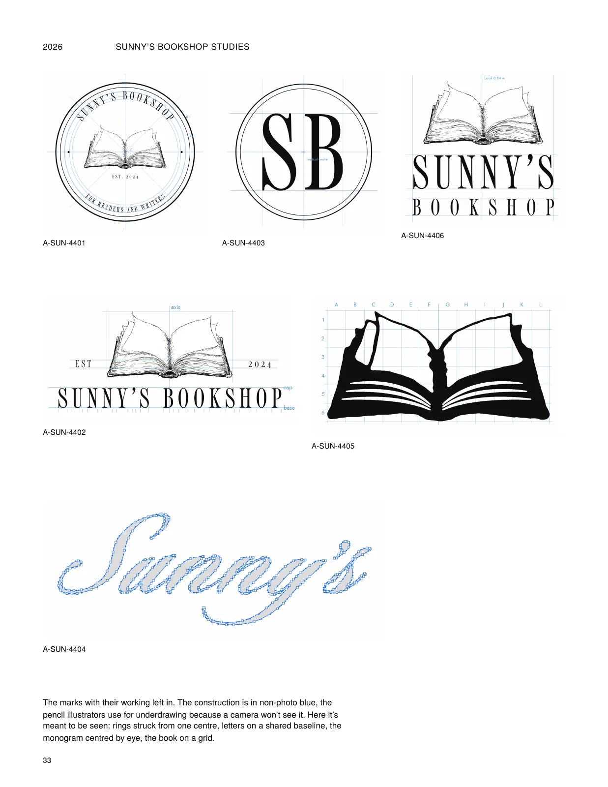
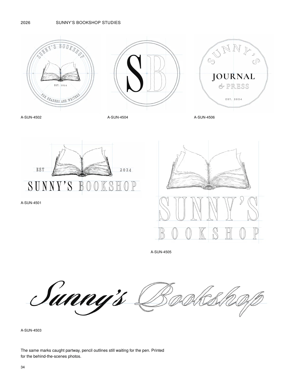
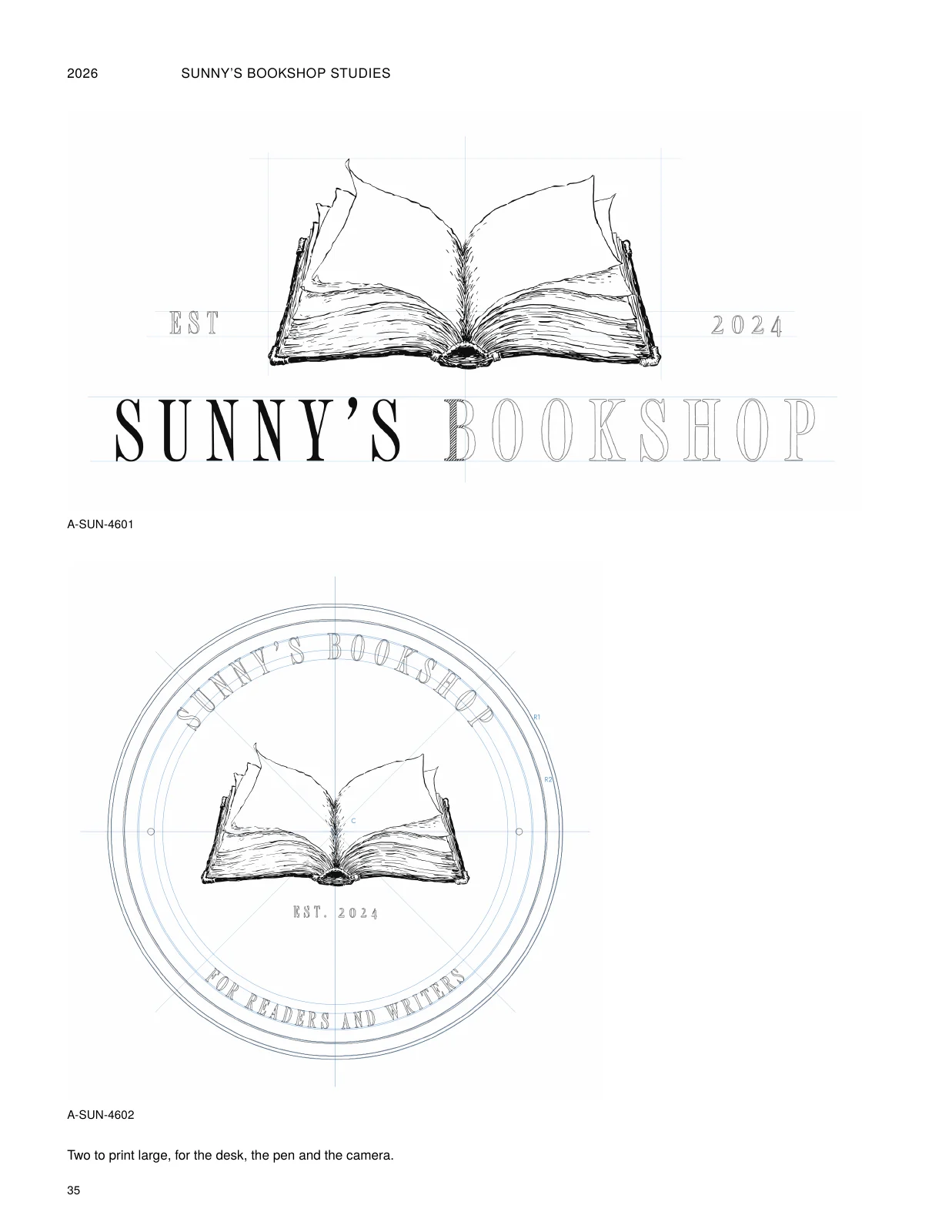
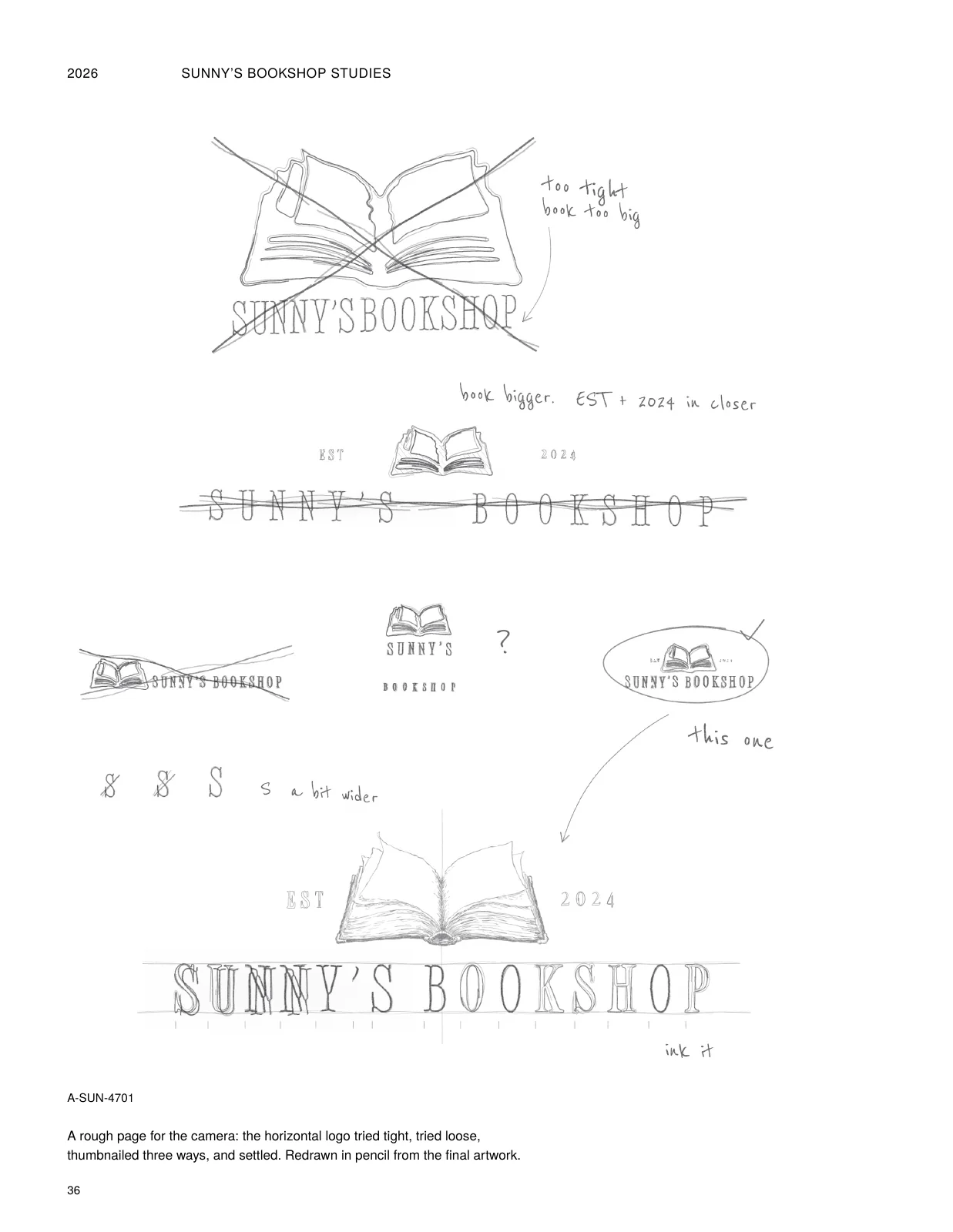
Final assets
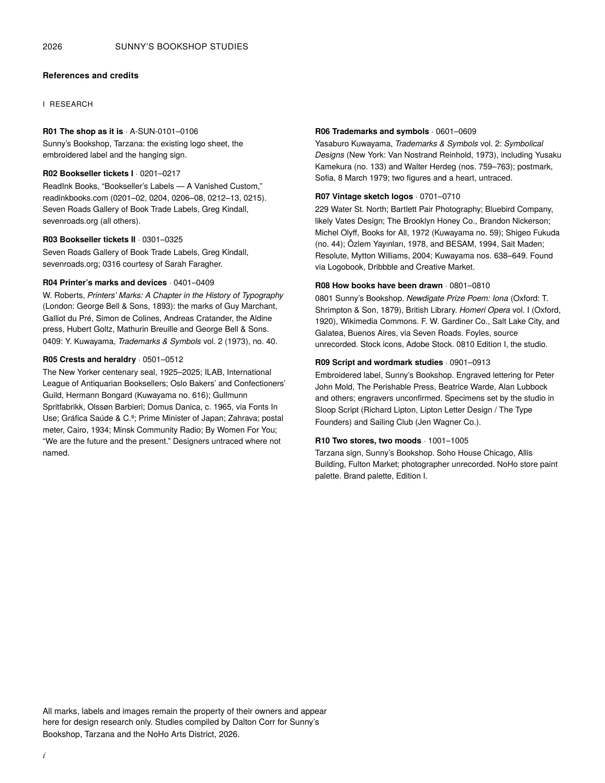
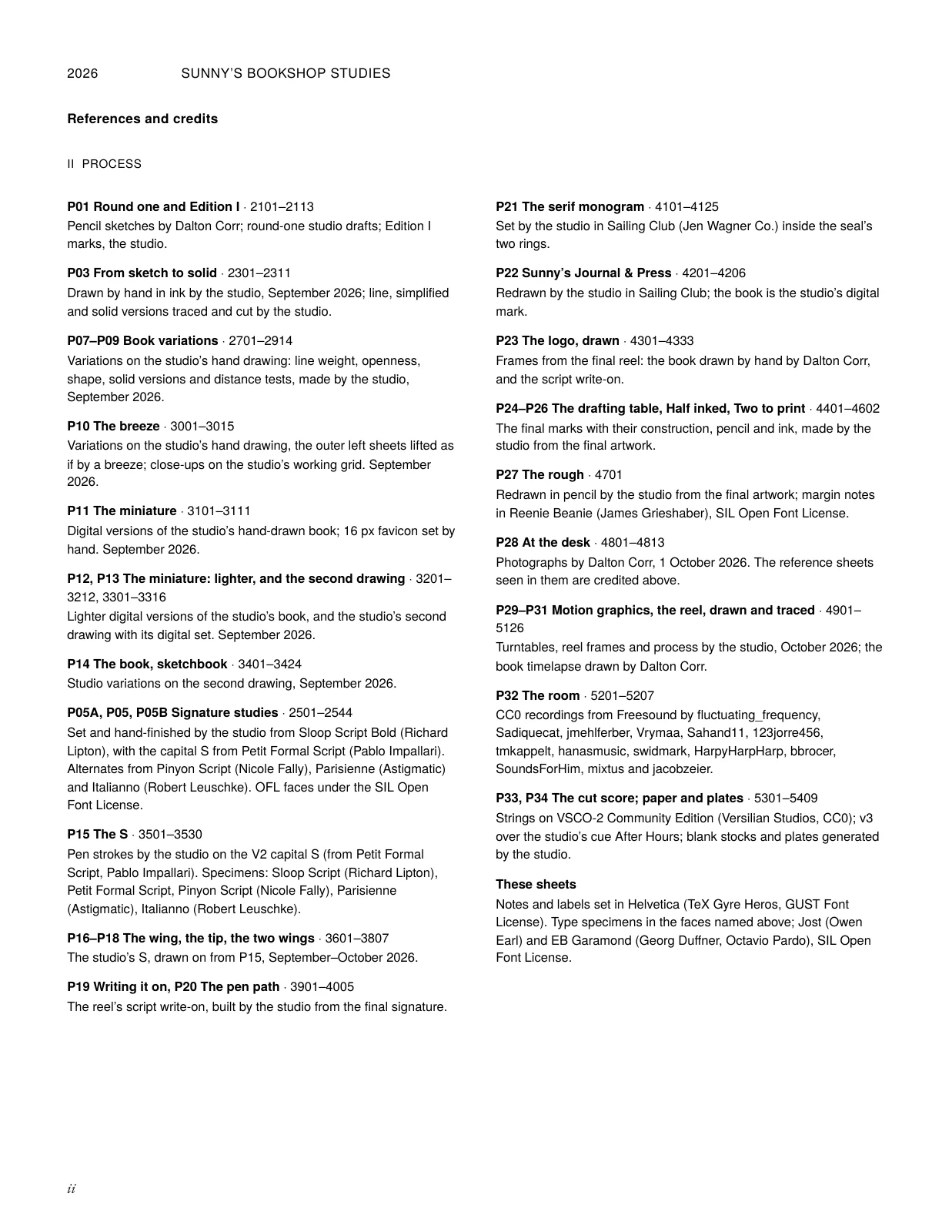
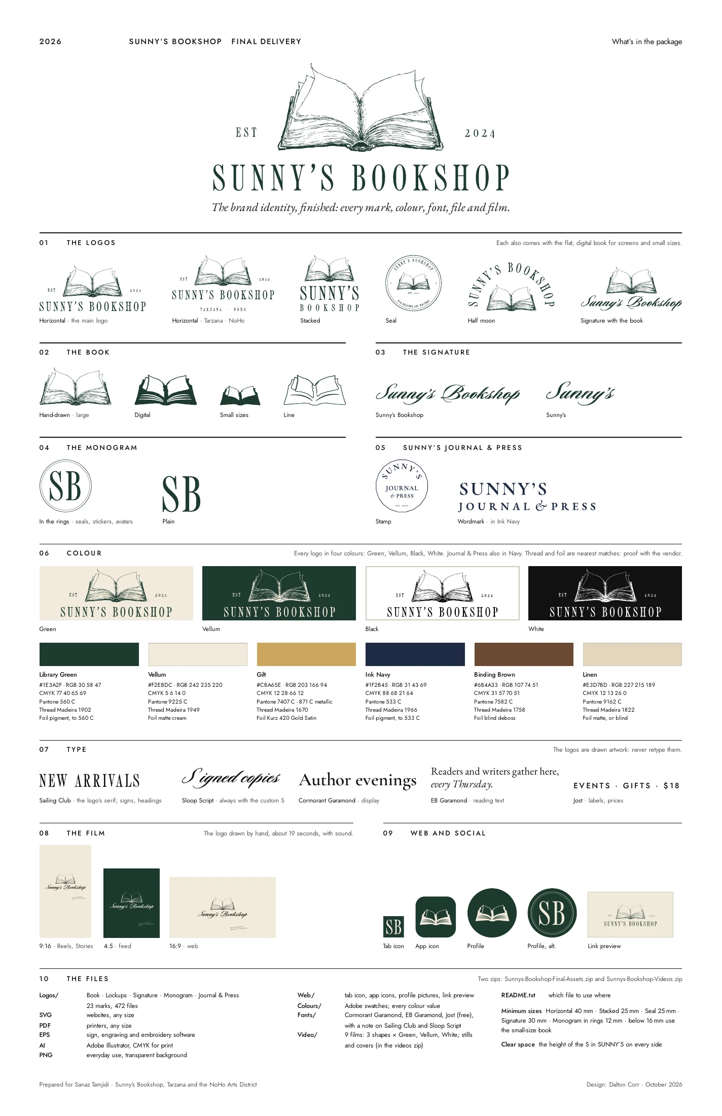
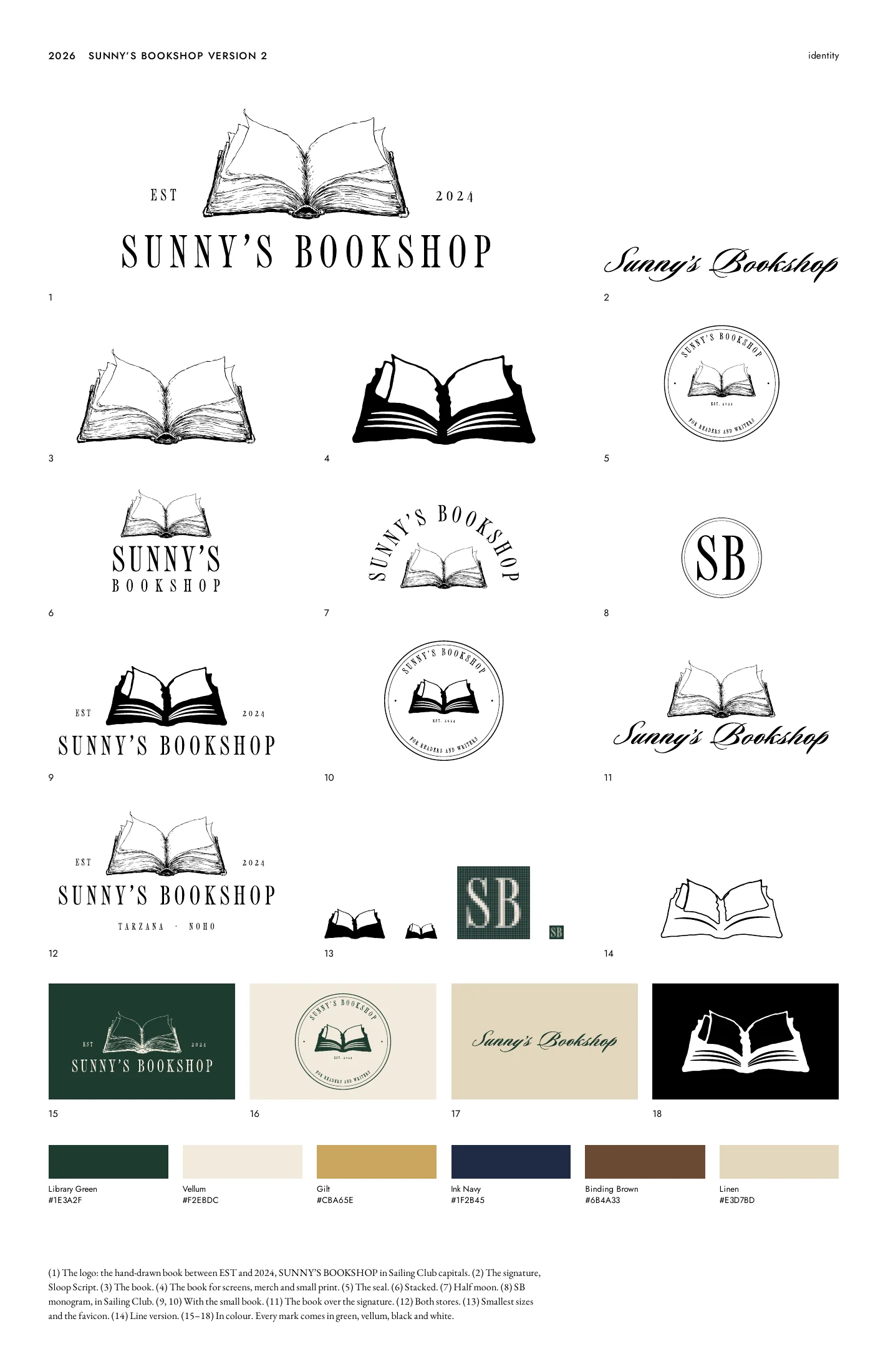
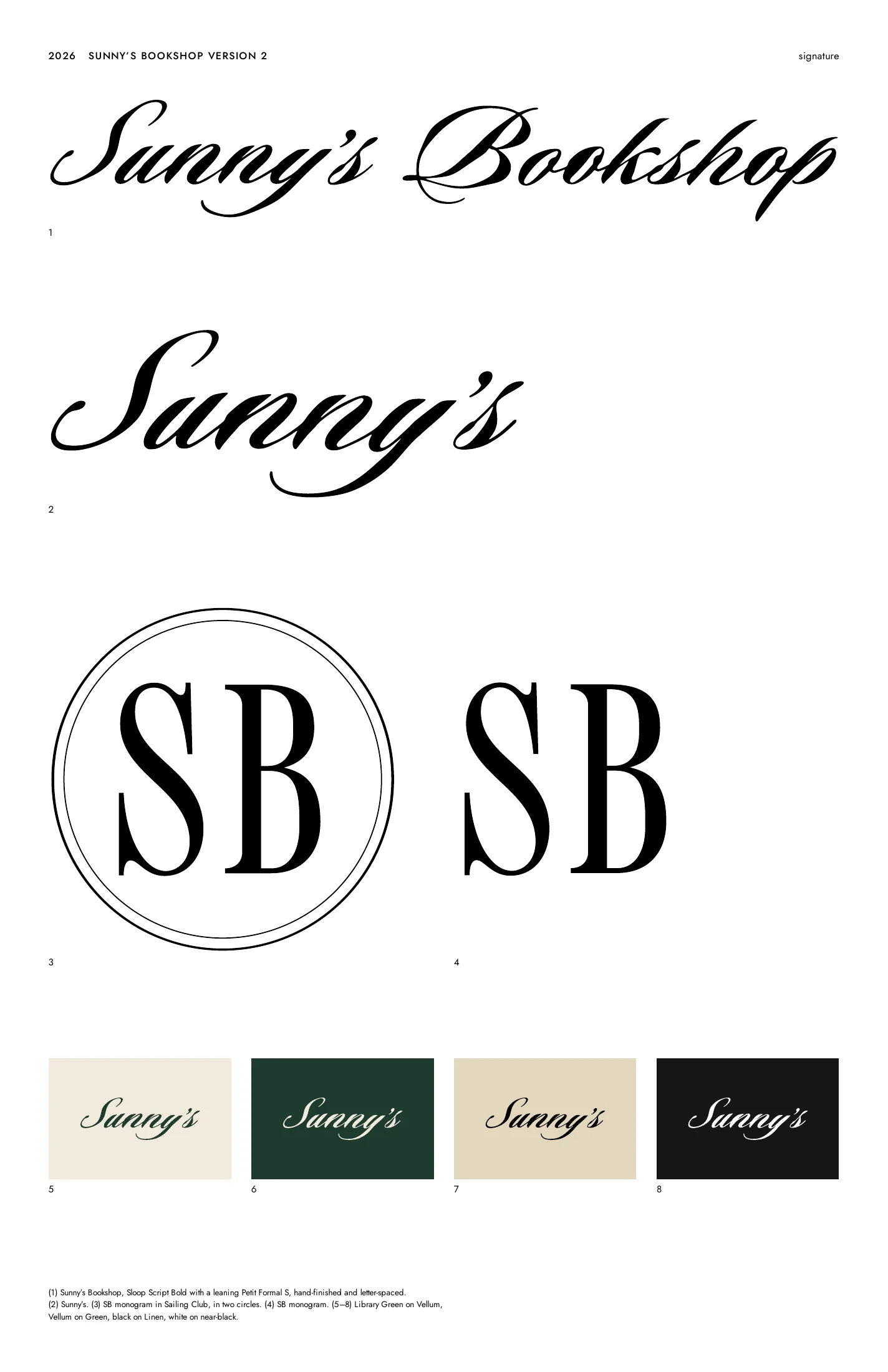
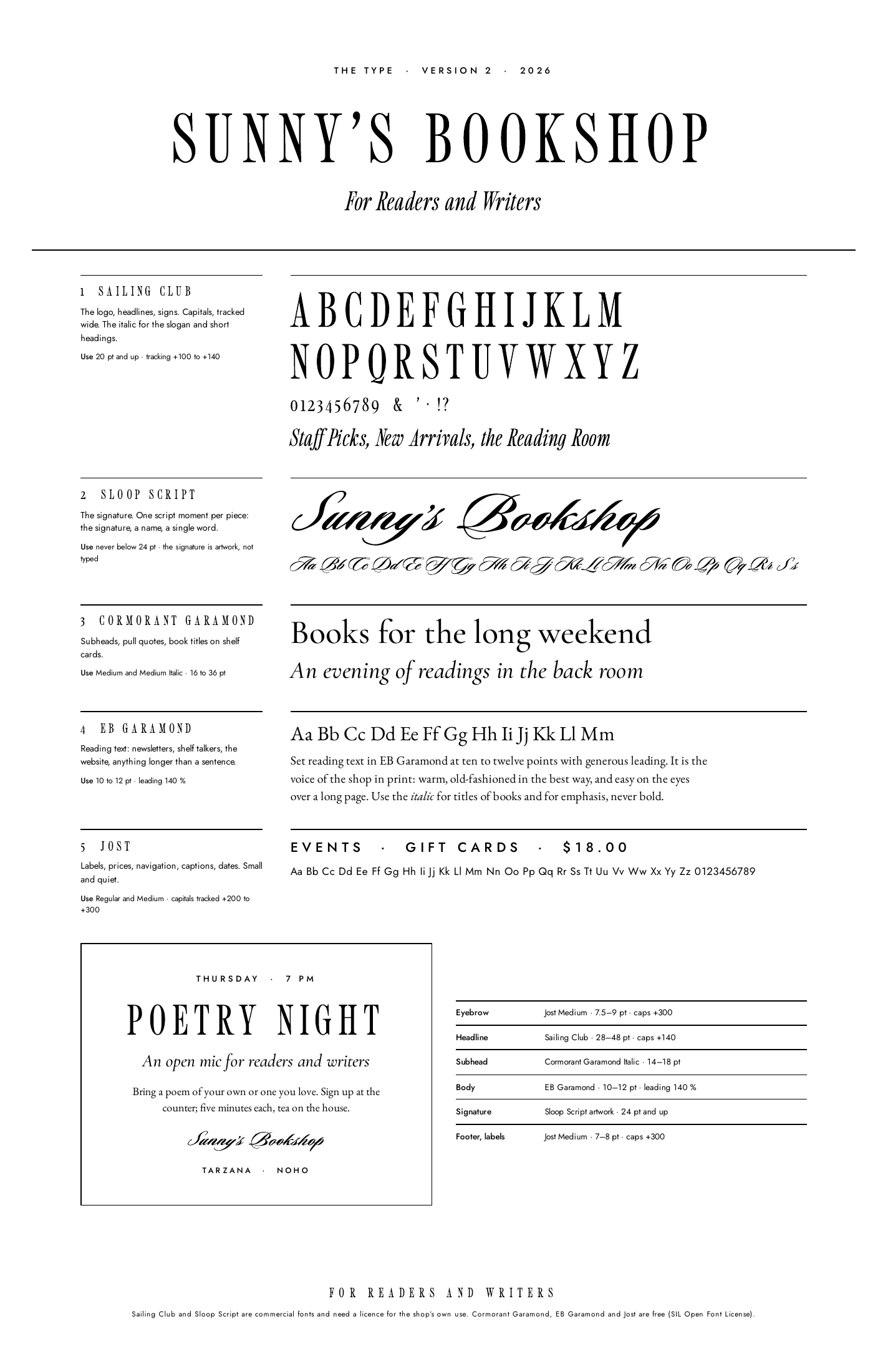
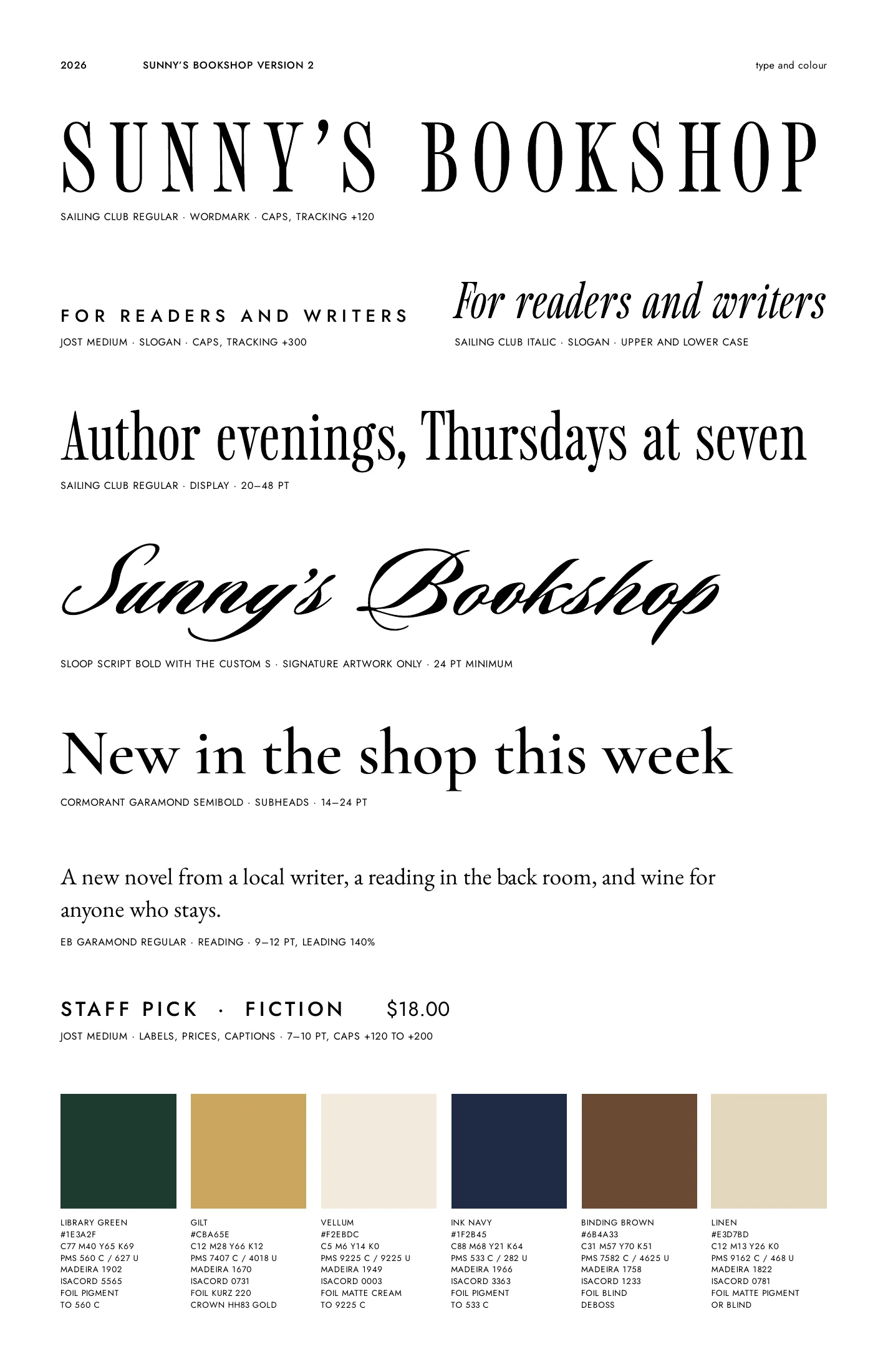
The finished marks with their construction left in, in non-photo blue, and the sheets that went out with the delivery.


Final delivery sheets, 5 pages
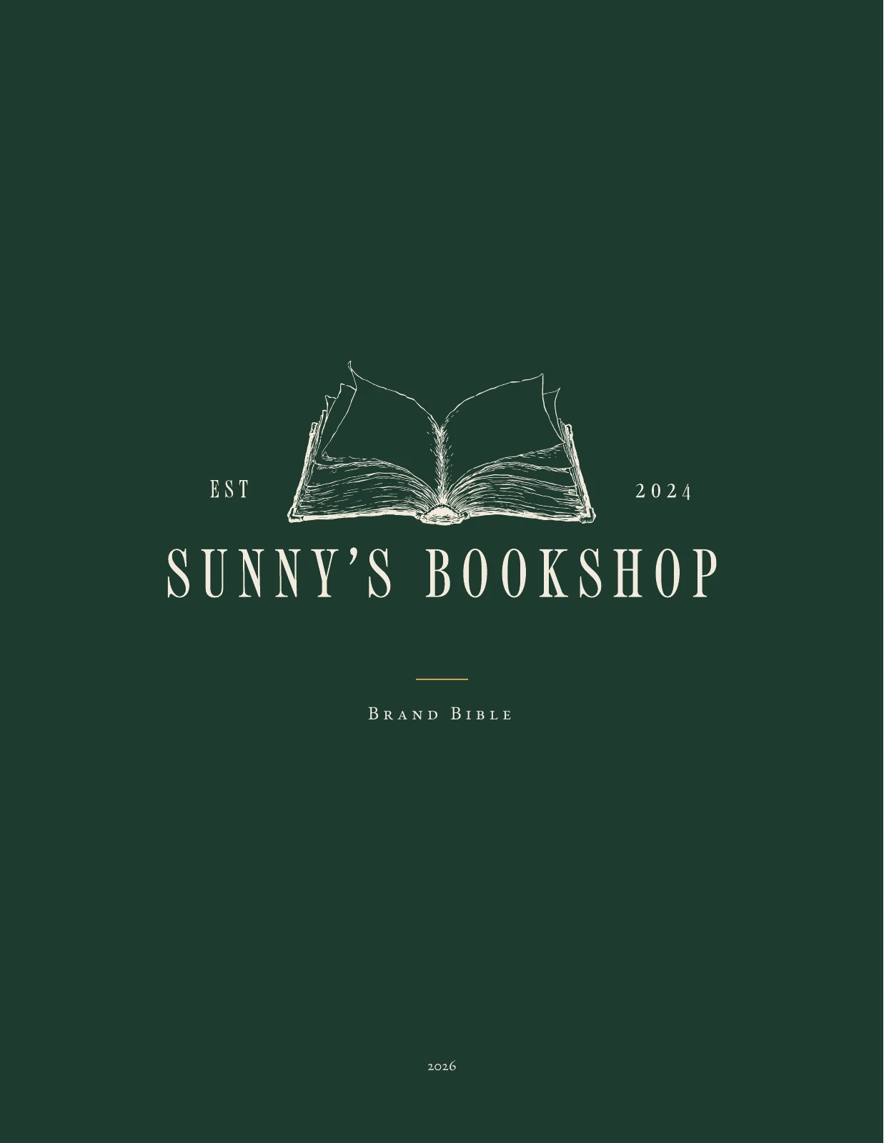
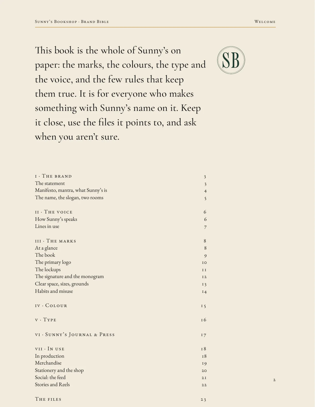
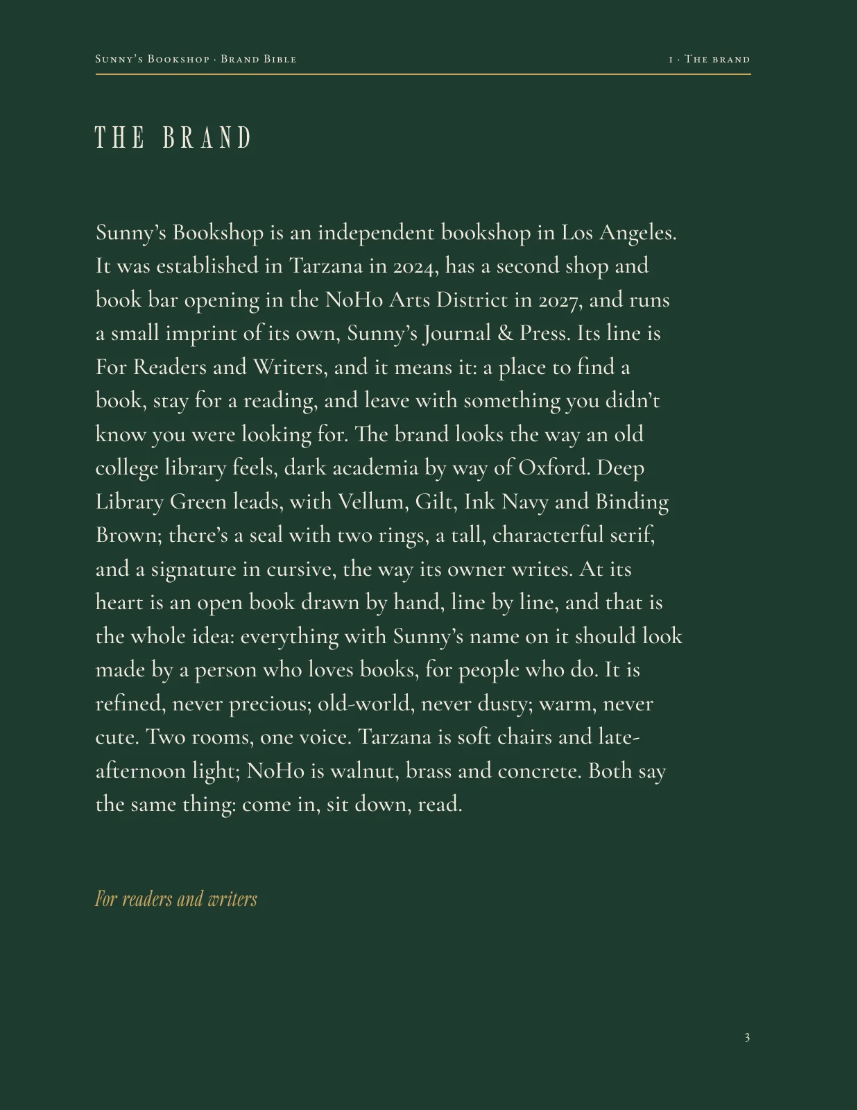
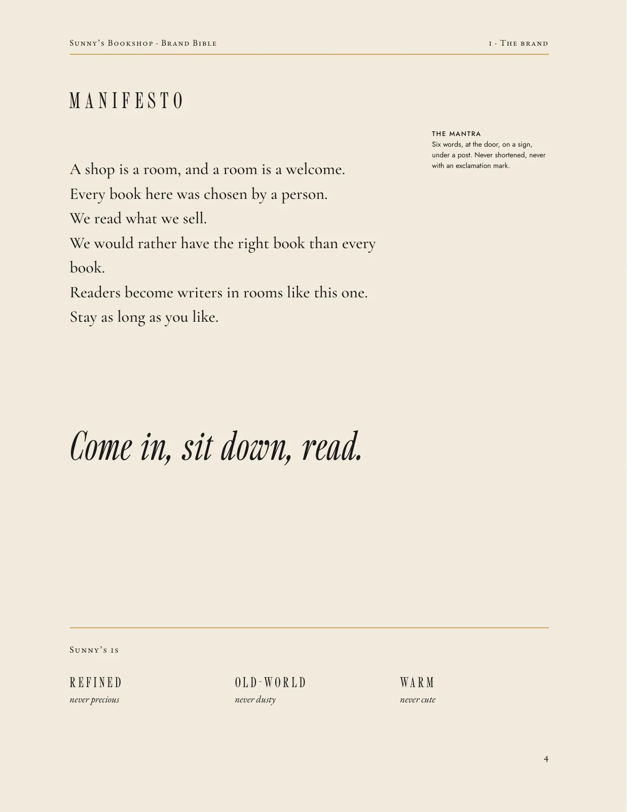
The Brand Bible
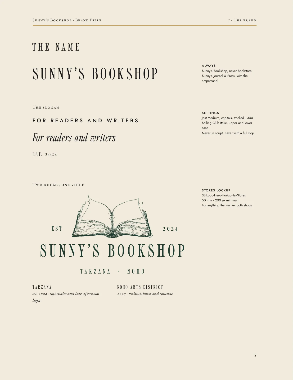
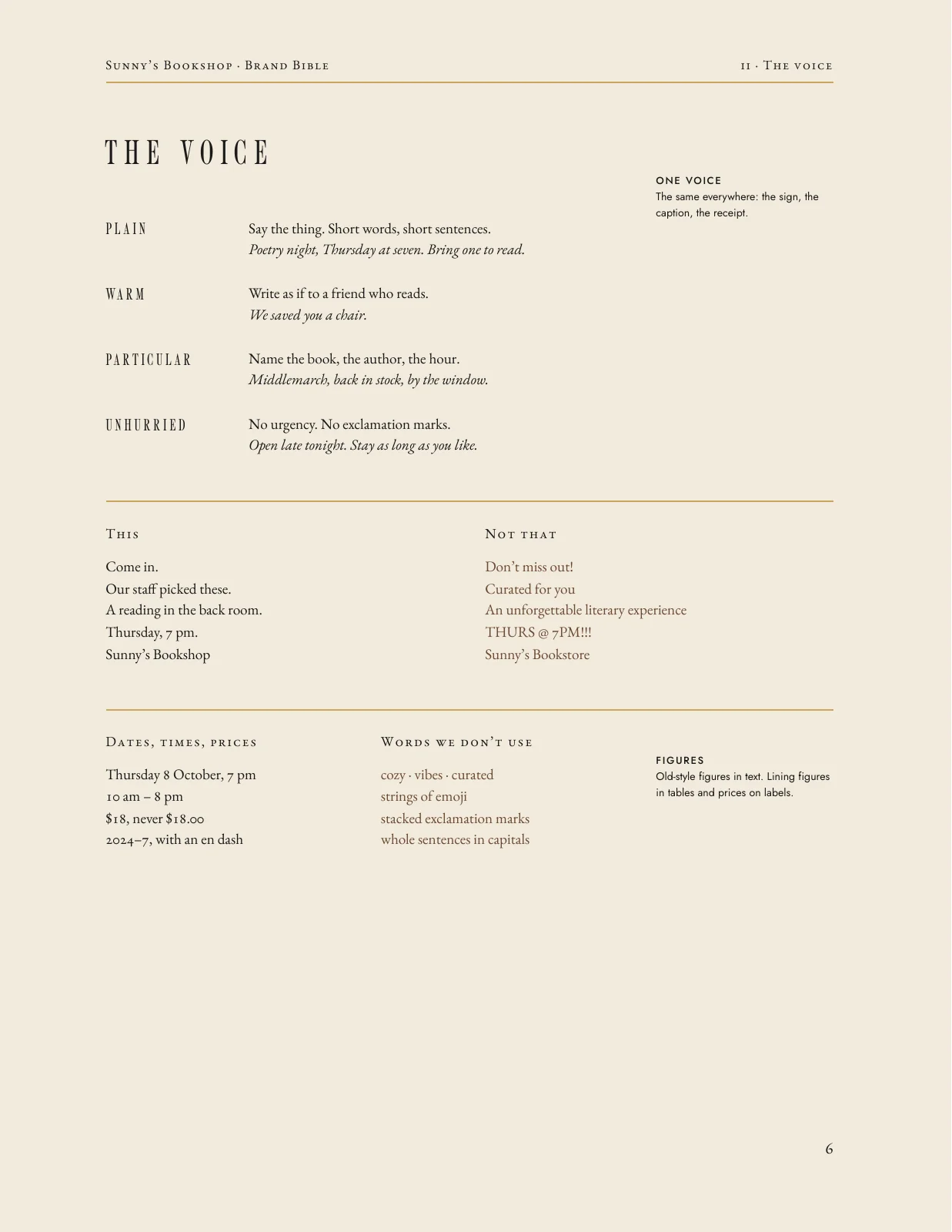
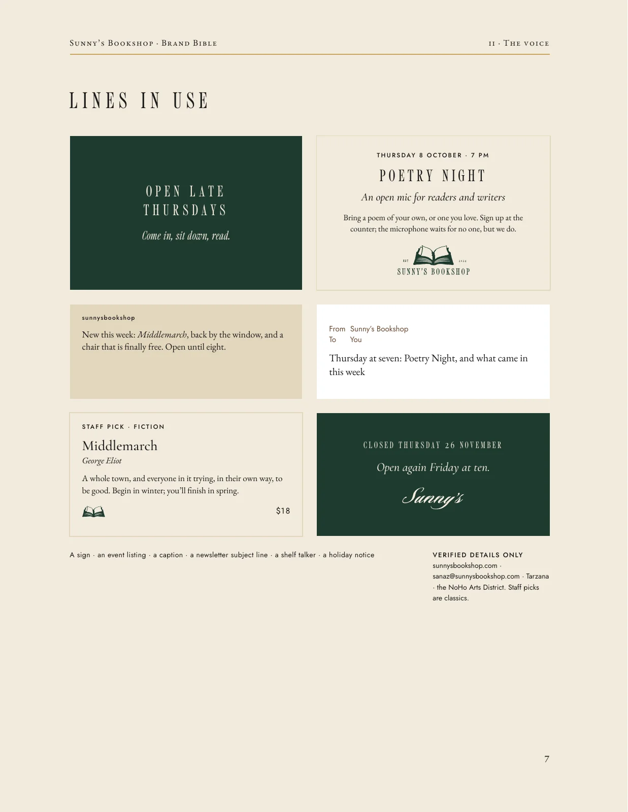
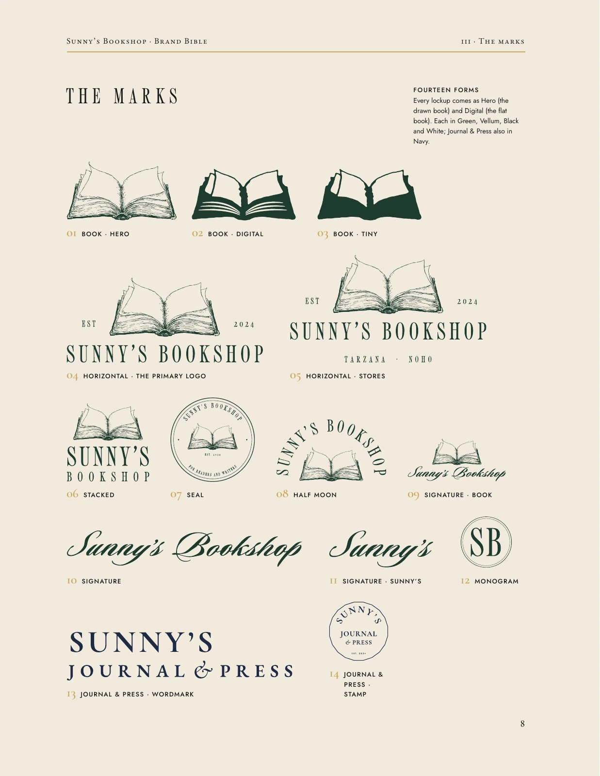
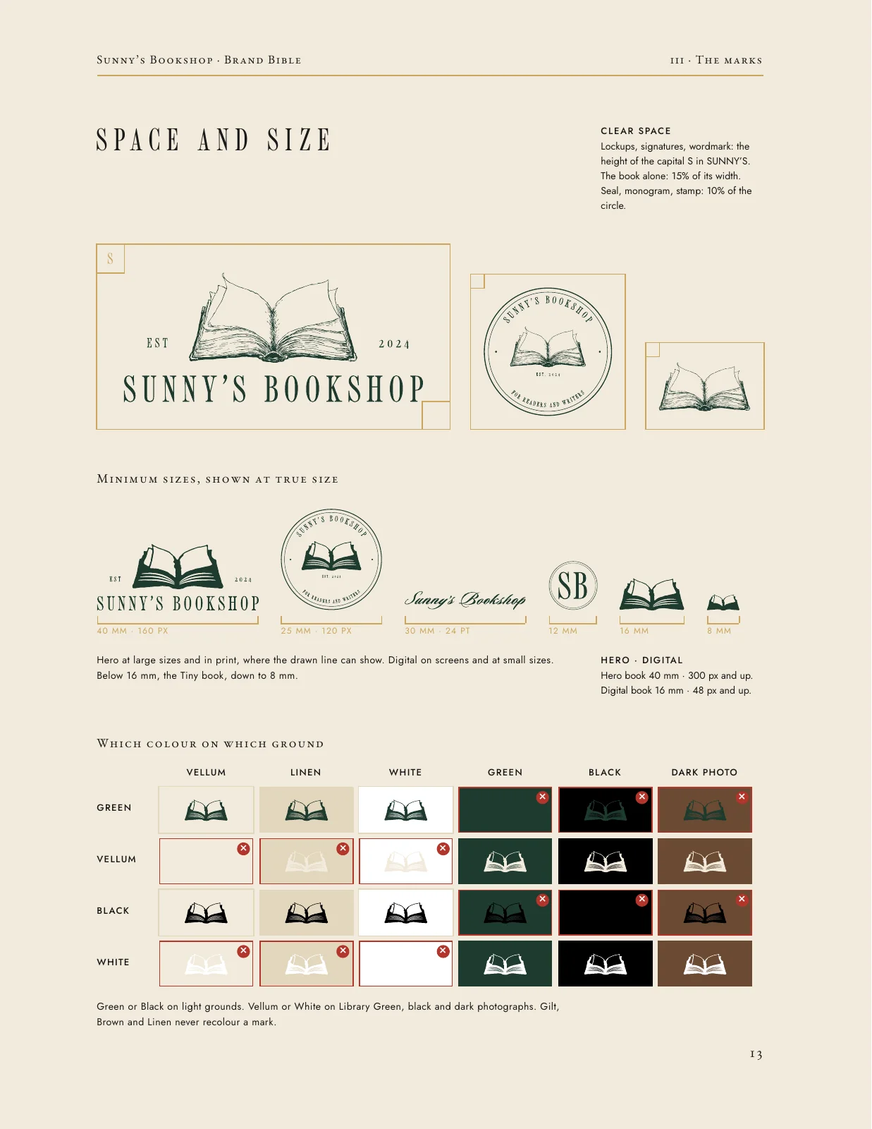
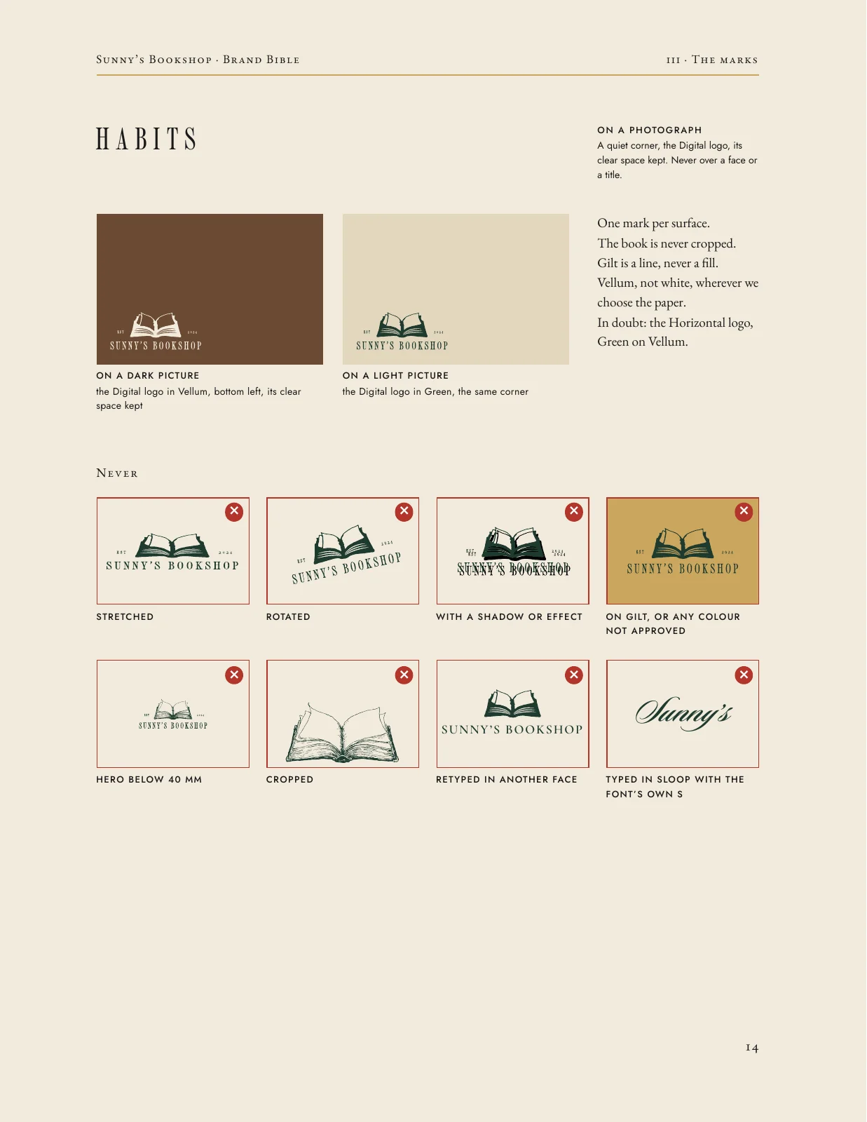
Twenty-four pages, set like a book, because it was for a bookshop.


The Brand Bible, 24 pages
View all pages
- 1 / 24 · Cover
- 2 / 24 · Welcome
- 3 / 24 · The brand
- 4 / 24 · Manifesto
- 5 / 24 · The name
- 6 / 24 · The voice
- 7 / 24 · Lines in use
- 8 / 24 · The marks
- 9 / 24 · The book
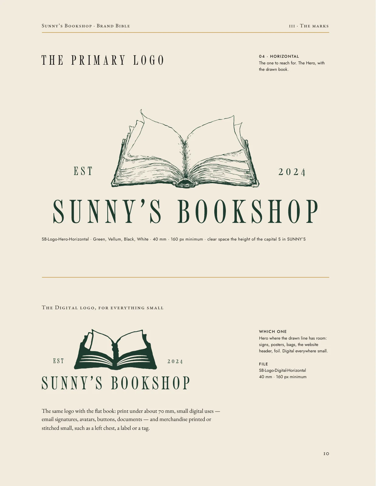
- 10 / 24 · The primary logo
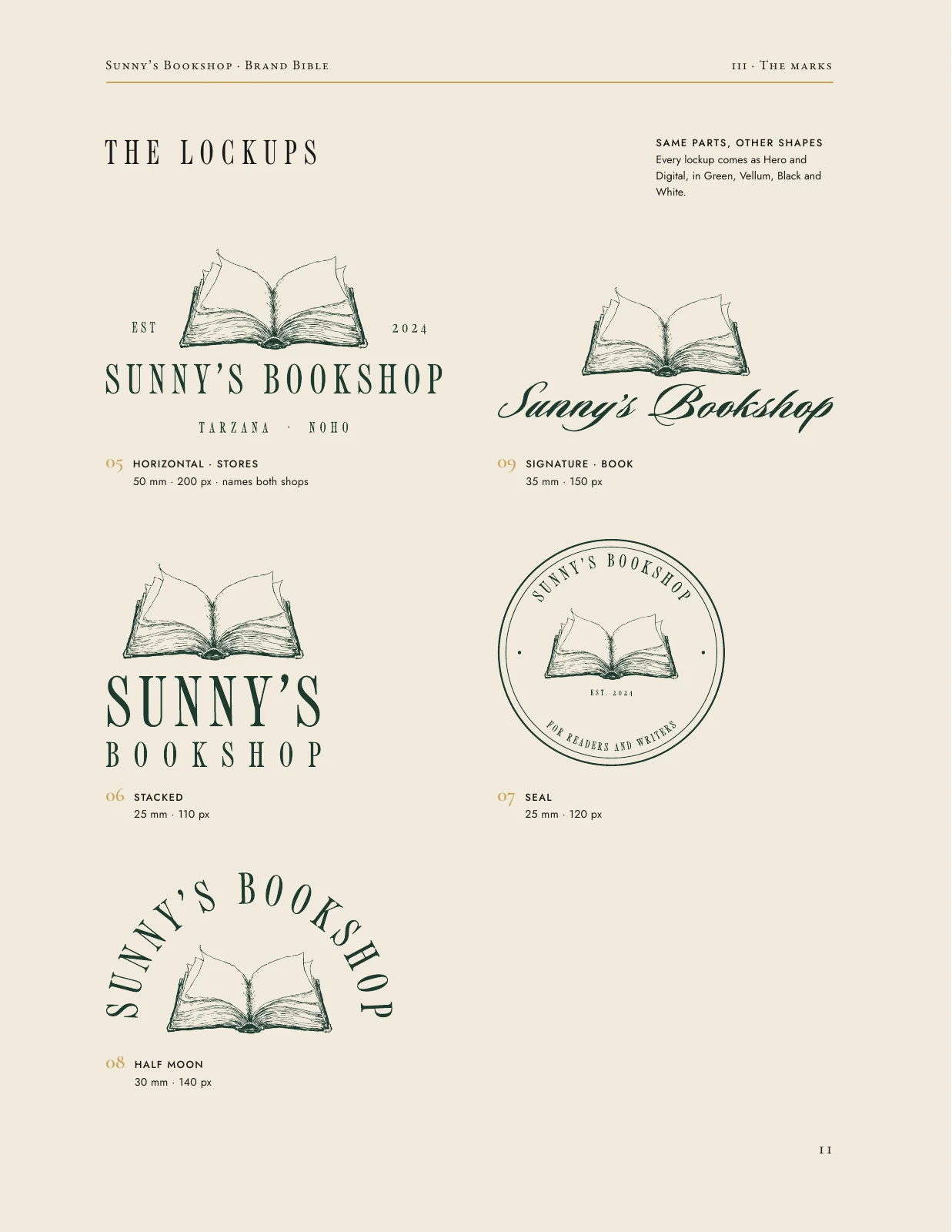
- 11 / 24 · The lockups
- 12 / 24 · The signature
- 13 / 24 · Space and size
- 14 / 24 · Habits
- 15 / 24 · Colour
- 16 / 24 · Type
- 17 / 24 · Sunny's Journal & Press
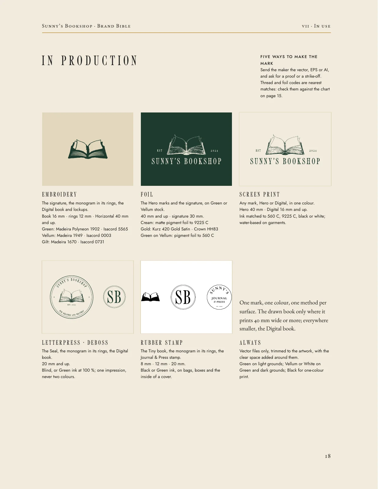
- 18 / 24 · In production
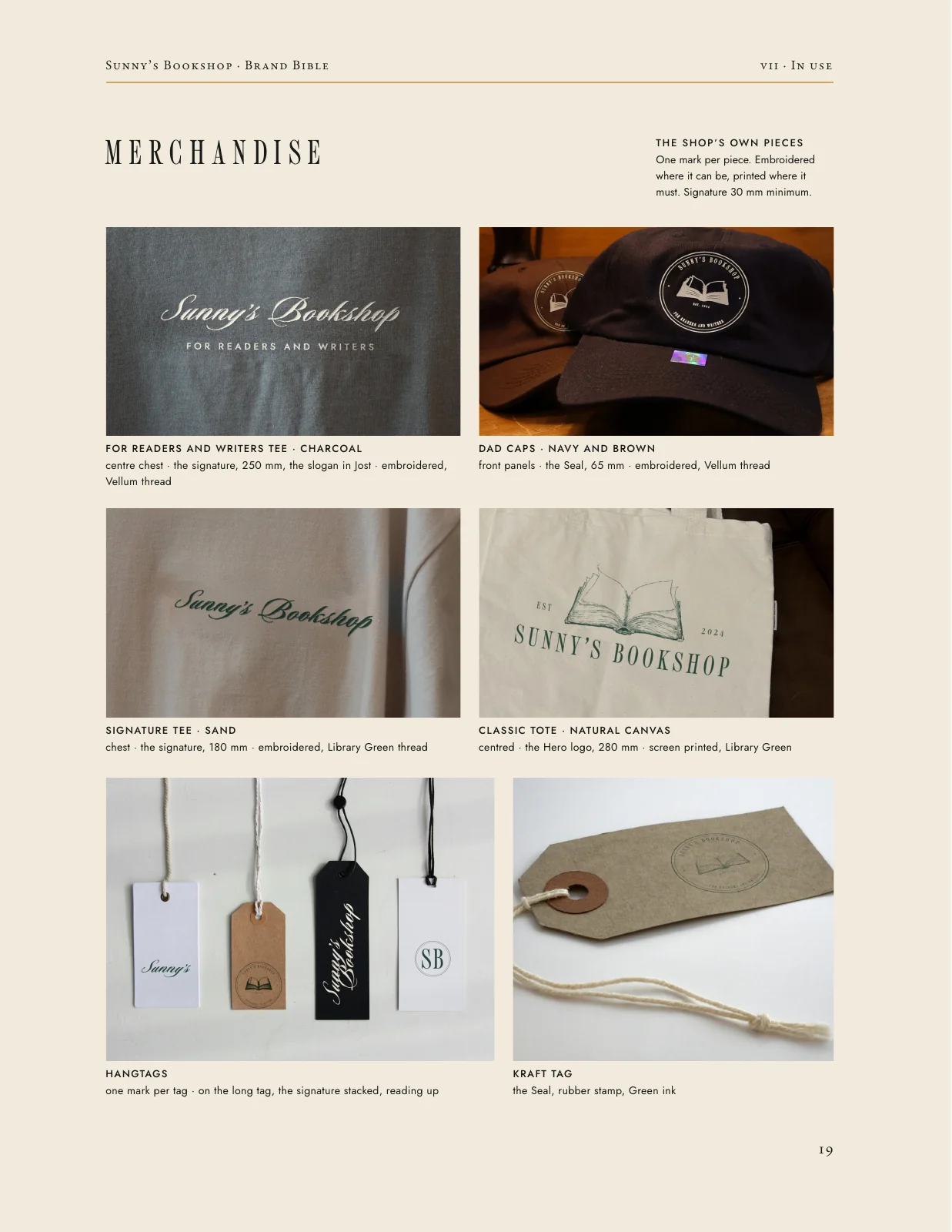
- 19 / 24 · Merchandise
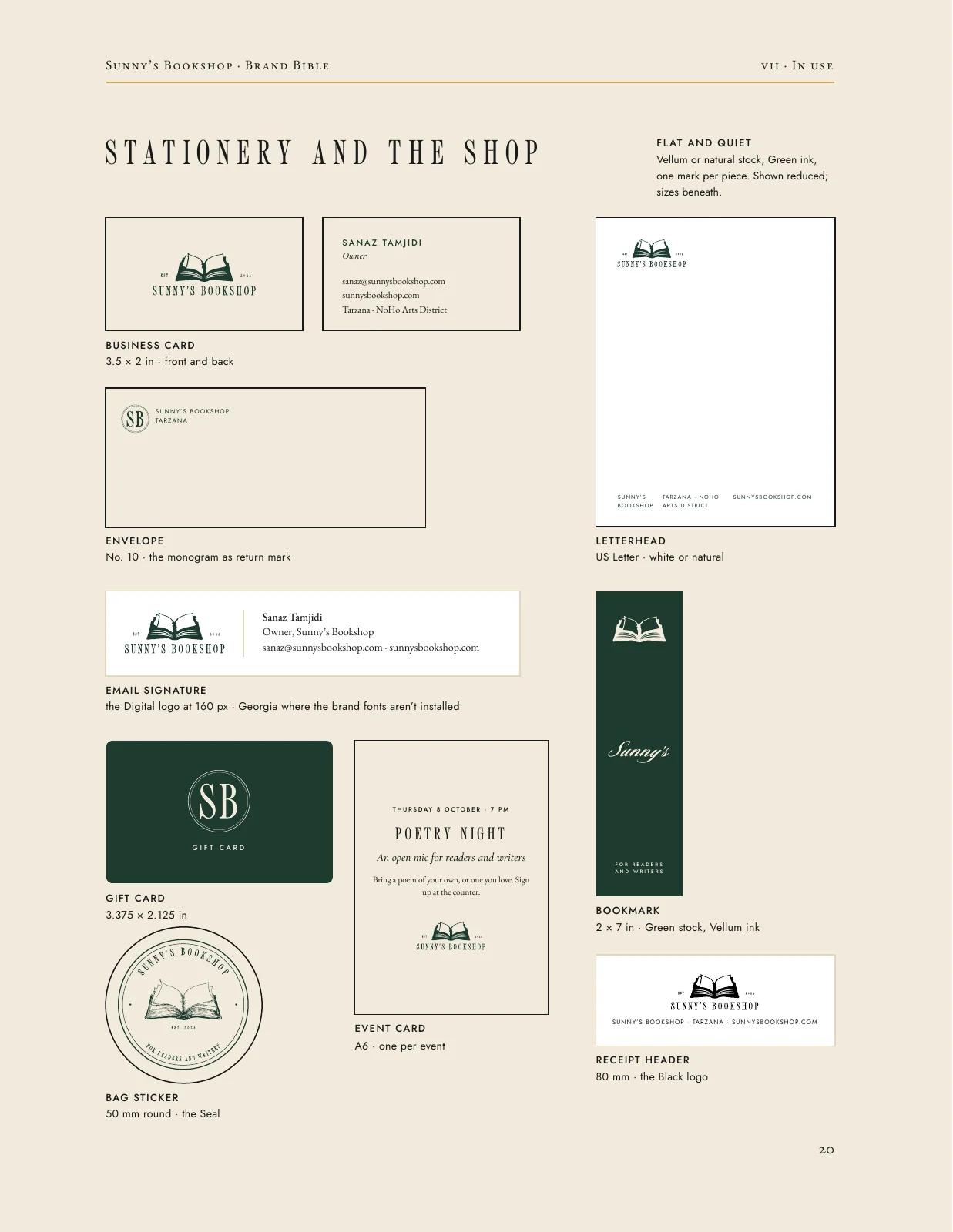
- 20 / 24 · Stationery and the shop
- 21 / 24 · Social
- 22 / 24 · Stories and reels
- 23 / 24 · The files
- 24 / 24 · Back cover
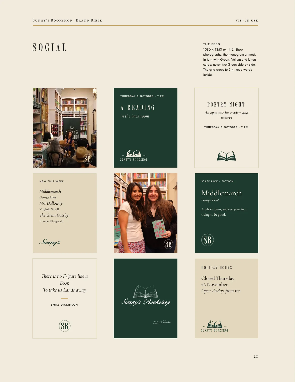
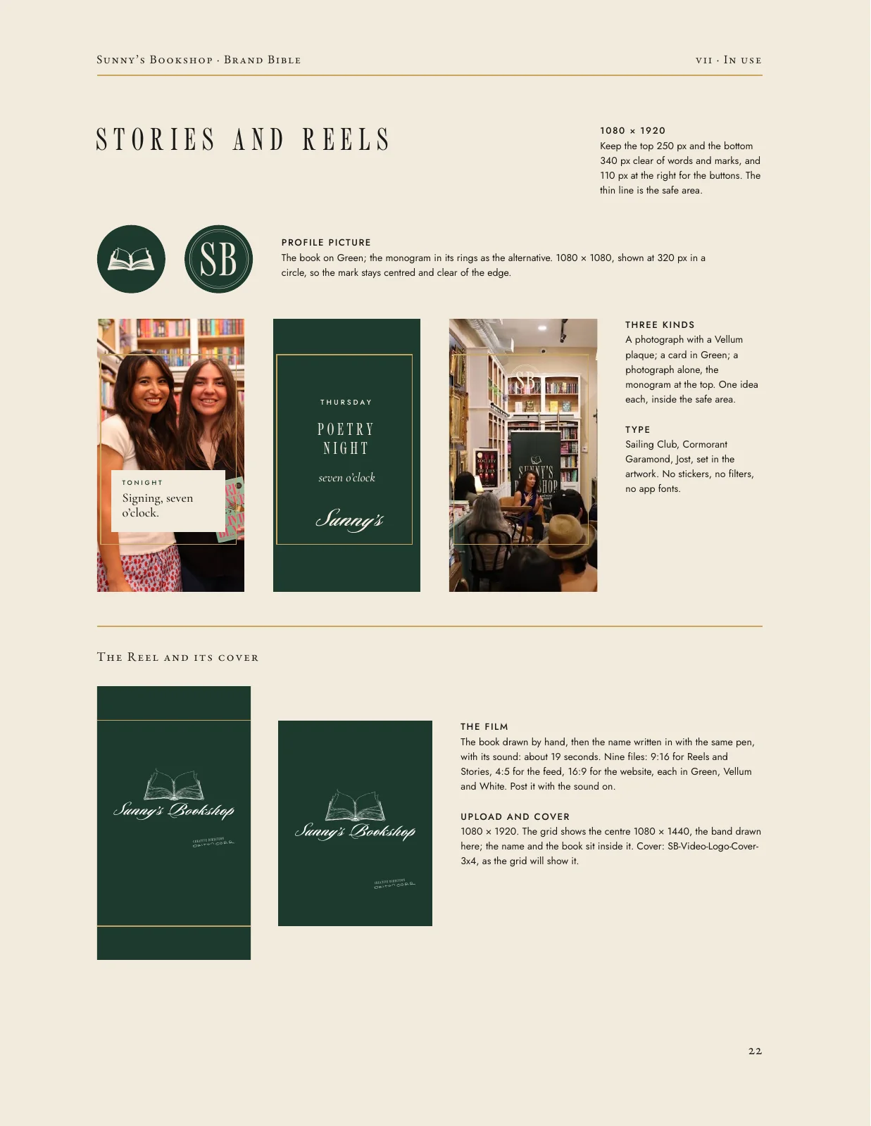
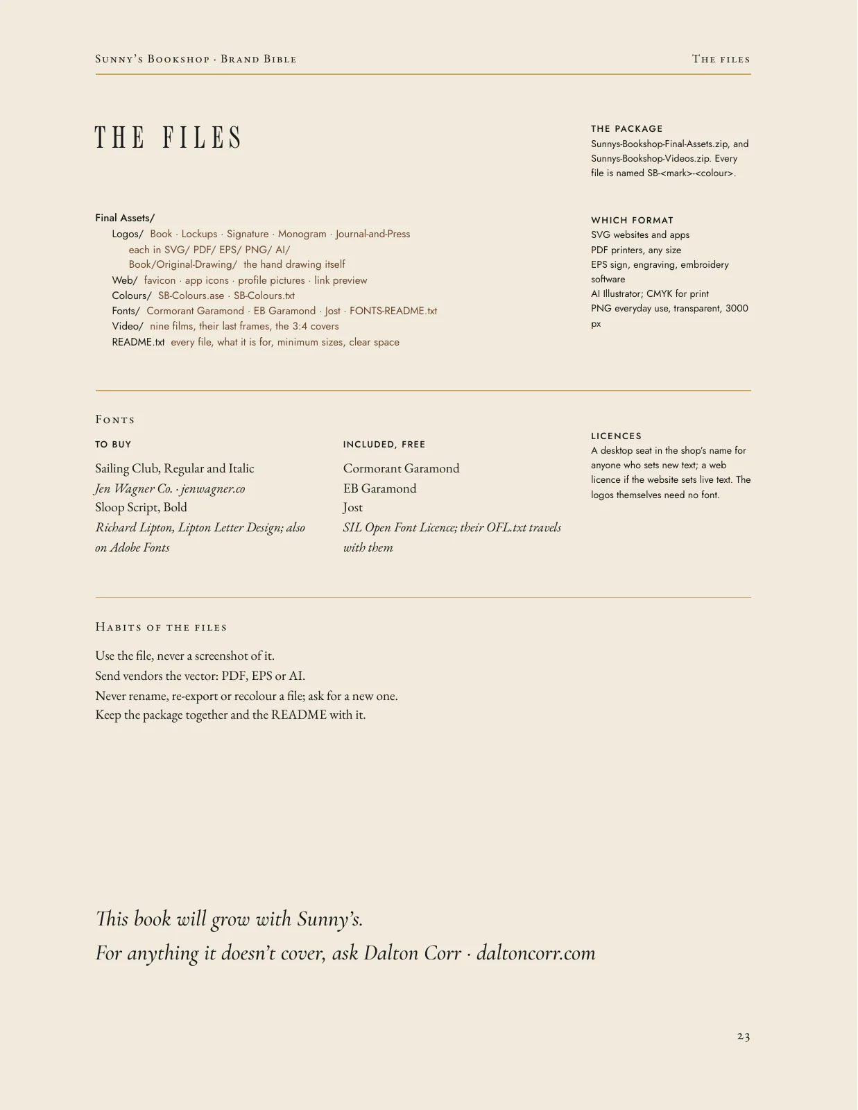
In the world


The announcement
Made to announce the new identity: the drawing, the type and the studies, set to the sound of the room.
Outcome
Delivered in October 2026: every mark in green, vellum, black and white, as SVG, PDF, EPS, AI and PNG, with the fonts, colour references down to Pantone, thread and foil, and the bible to keep it all consistent. The identity is ready for the NoHo opening in 2027.
Credits
- Client
- Sunny's Bookshop, Tarzana and the NoHo Arts District, Los Angeles
- Owner
- Sanaz Tamjidi
- Scope
- Creative direction, full rebrand and logo design (Dalton Corr)
- Deliverables
- Hand-drawn book mark (hero and small-size versions); seal; signature; SB monogram; horizontal, stacked, half-moon and signature lockups; Sunny's Journal & Press wordmark and stamp; typography and colour (Pantone, thread and foil references); 24-page Brand Bible; master asset package; announcement film
- Typefaces
- Sailing Club, Jen Wagner Co. · Sloop Script, Font Bureau, with a custom S · Cormorant Garamond, EB Garamond and Jost, SIL Open Font License
- Photography
- Dalton Corr. Merchandise mockups on Sunny's Bookshop's own product photos and stock blanks.
- Year
- 2026